Brand identities that hold up at 16 pixels and on a hoarding.
Logos, identity systems and brand guidelines from the same studio that builds your website, so the brand is designed for every place it actually has to work.
The working Branding
One we built: HarbourStone.
Each numbered note marks a decision we made on the real site, not a feature list.
- Starts with
- A written brand discovery questionnaire
- You receive
- A logo system in every layout and colourway, print and screen files, and brand guidelines
- Recent example
- HarbourStone: questionnaire to final files in two weeks
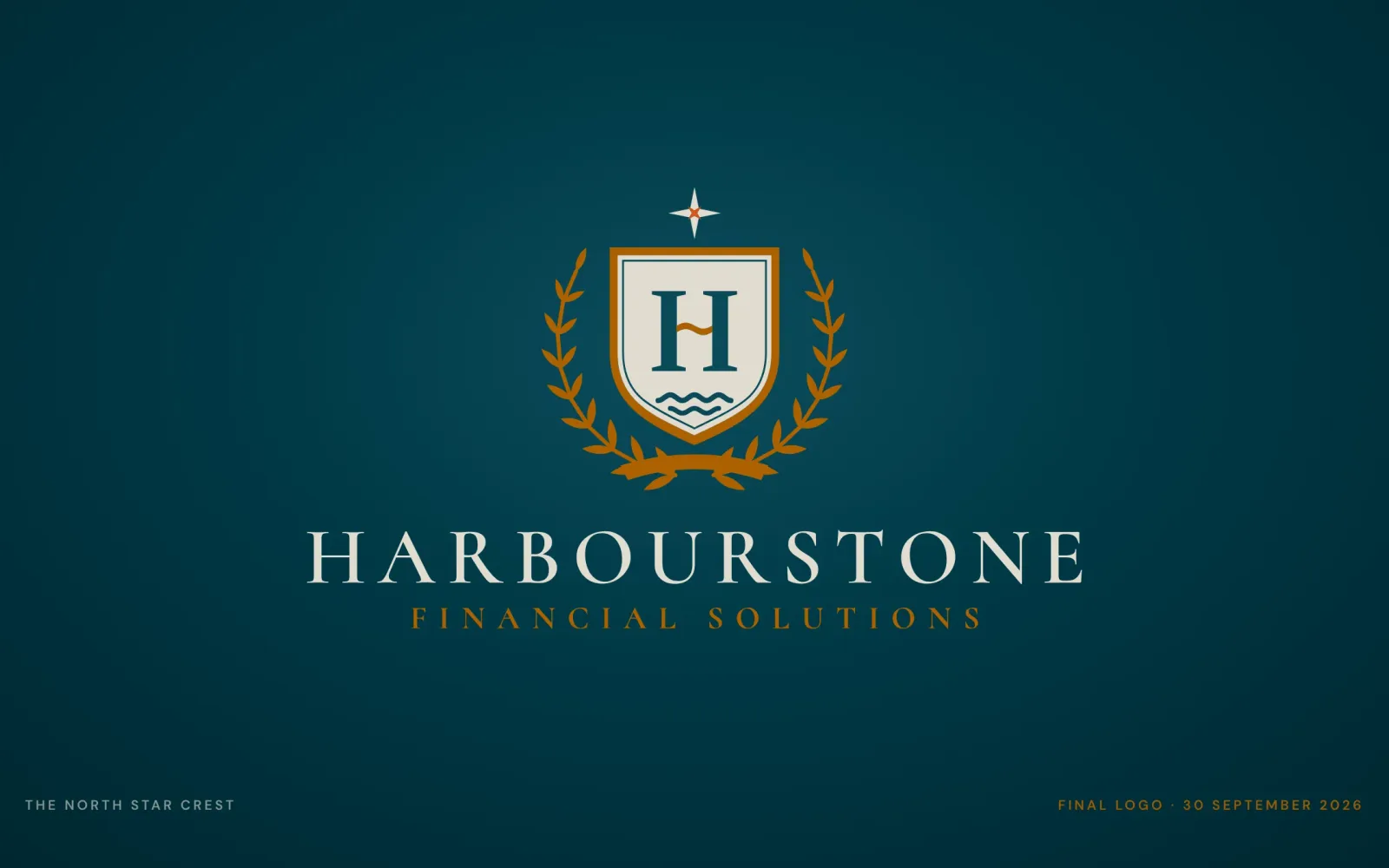
- 01The four-point North Star from round two. The client tried two other stars, then came back to it.
- 02The H carries a wave in its crossbar: the harbour is in the letter, not added beside it.
- 03Laurel and ribbon taken from the shortlisted Crest concept the client asked us to merge in.
- 04Navy, gold and stone only: Sun Life's secondary palette, never its yellow, so it can sit beside their logo.
We show real range first, then narrow it with you.
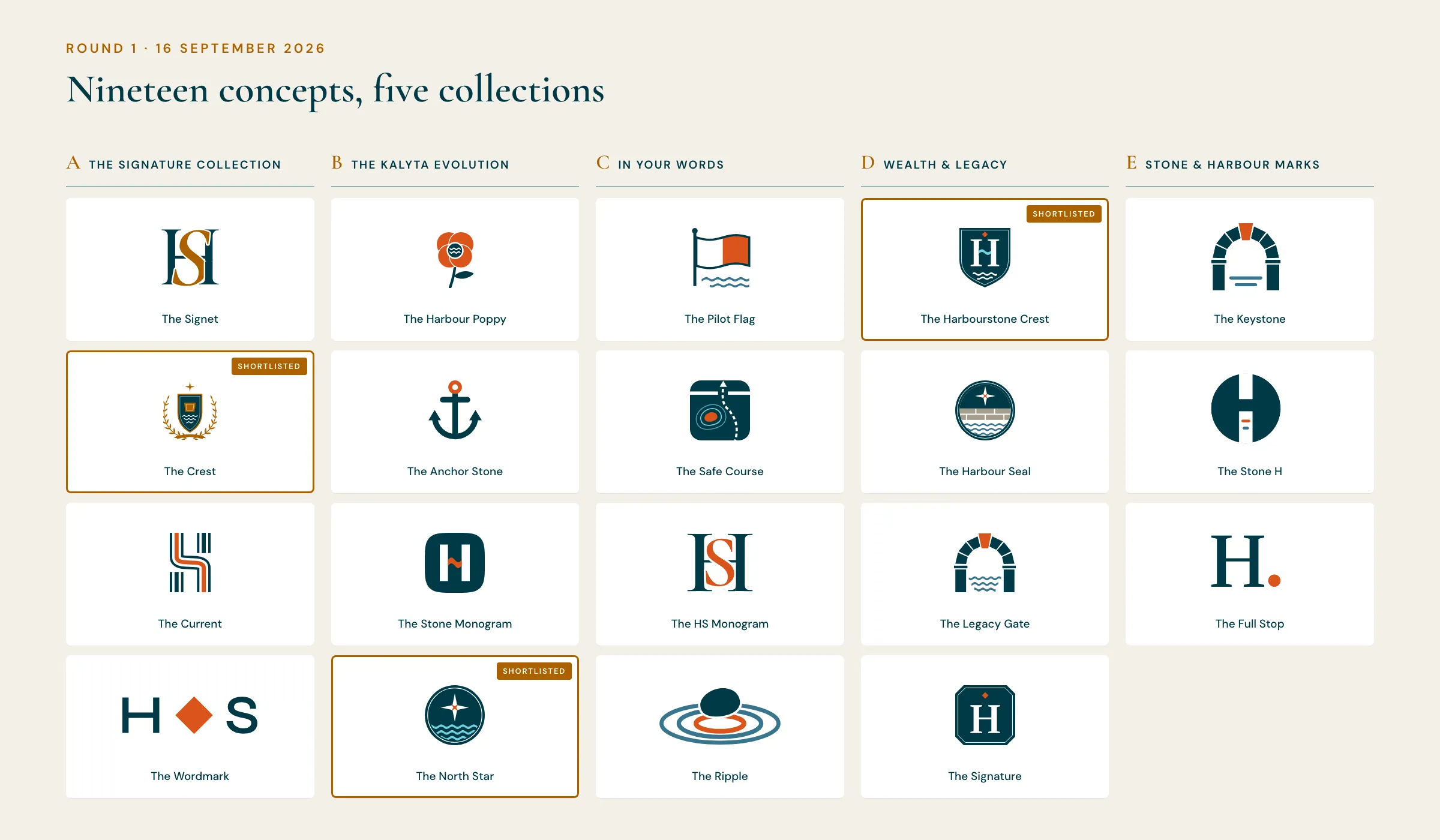
A mark is chosen, not just refined, so the first round has to show genuinely different ideas rather than three variations of one. HarbourStone's first presentation had 19 concepts across five collections, each shown on stationery, signage and screens before anyone was asked to pick.
From there it narrows quickly. The client shortlisted three and asked us to merge them; the final crest combines the strongest part of each, and every revision round arrived as a full presentation rather than a loose file.
- Concepts drawn as vectors from the start, never generated by an image model
- Every concept shown in use, at favicon size and at full scale
- Each revision round answered with a full presentation and our reasoning
Partner rules, two languages and a submission deadline.
HarbourStone is a Sun Life advisory practice, so its logo has to sit beside Sun Life's under a co-branding specification: only their secondary palette, never their yellow, set lockups, and a file package in their exact folder structure for approval.
We read the specification before drawing anything, then delivered the mark in English, French and a bilingual lockup, each in vertical, horizontal, icon, wordmark and shield-only layouts.
- 360 logo files across three languages, four colourways and five layouts
- AI, EPS, PDF, SVG, PNG and JPEG, in CMYK for print and RGB for screen
- Submission packs built to the partner's spec, ready to send for approval

A brand is seen on a hoarding long before anyone visits the website.
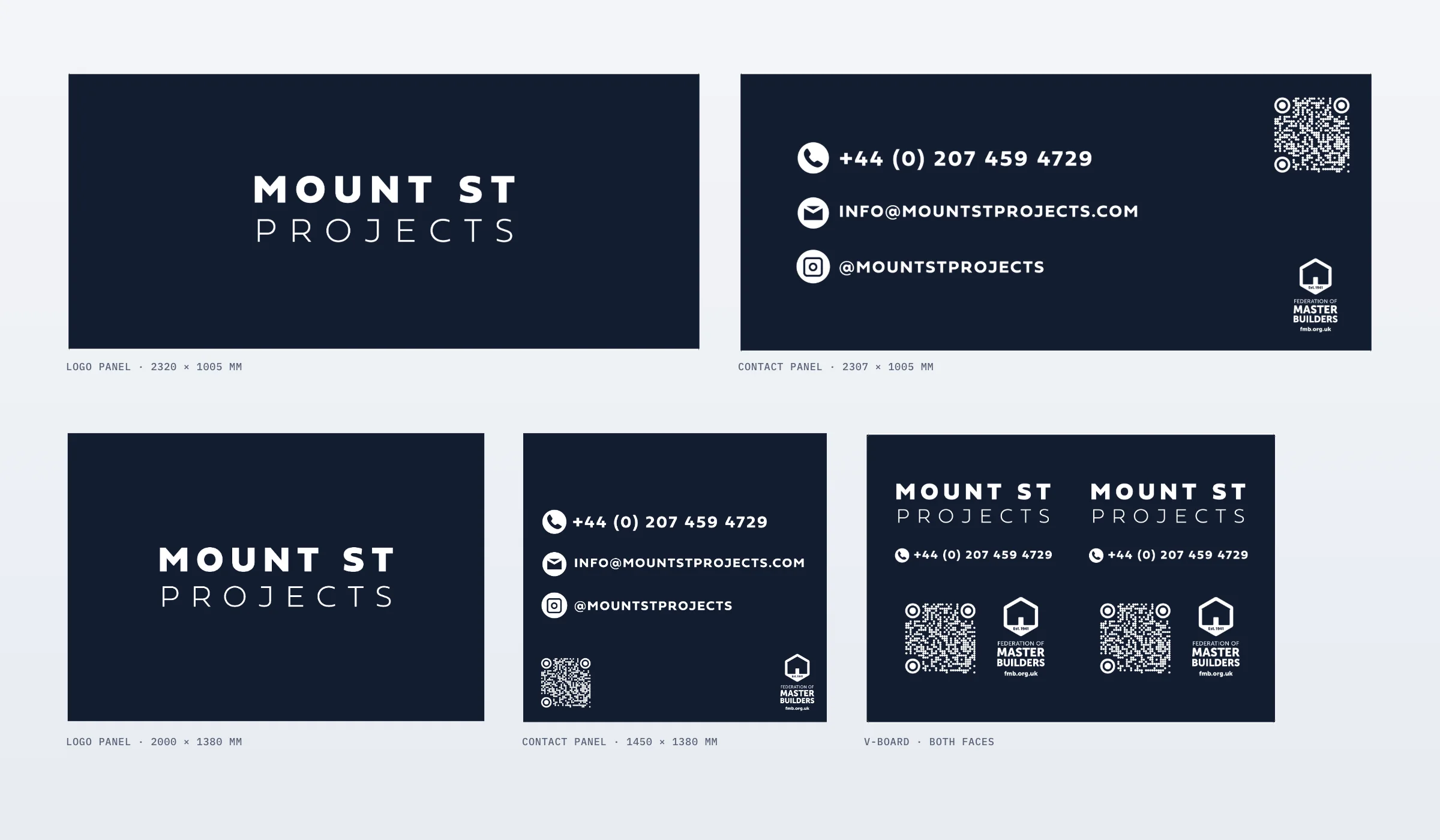
For Mount St Projects, a London building contractor, we designed the identity as one system across everything a client or neighbour actually sees: site hoarding at two panel heights, a V-board, the van, workwear, stationery, a corporate brochure, neighbourhood leaflets and Instagram, then the website.
- Two colours and one typeface, with kerning written into the guidelines so every printer builds it the same way
- Large-format artwork sized to real hoarding panels, readable from across the road
- The same rules carried onto the website, so the navy on the hoarding and the navy online are clearly one company
Colour with a job to do, and a mark that survives a home screen.
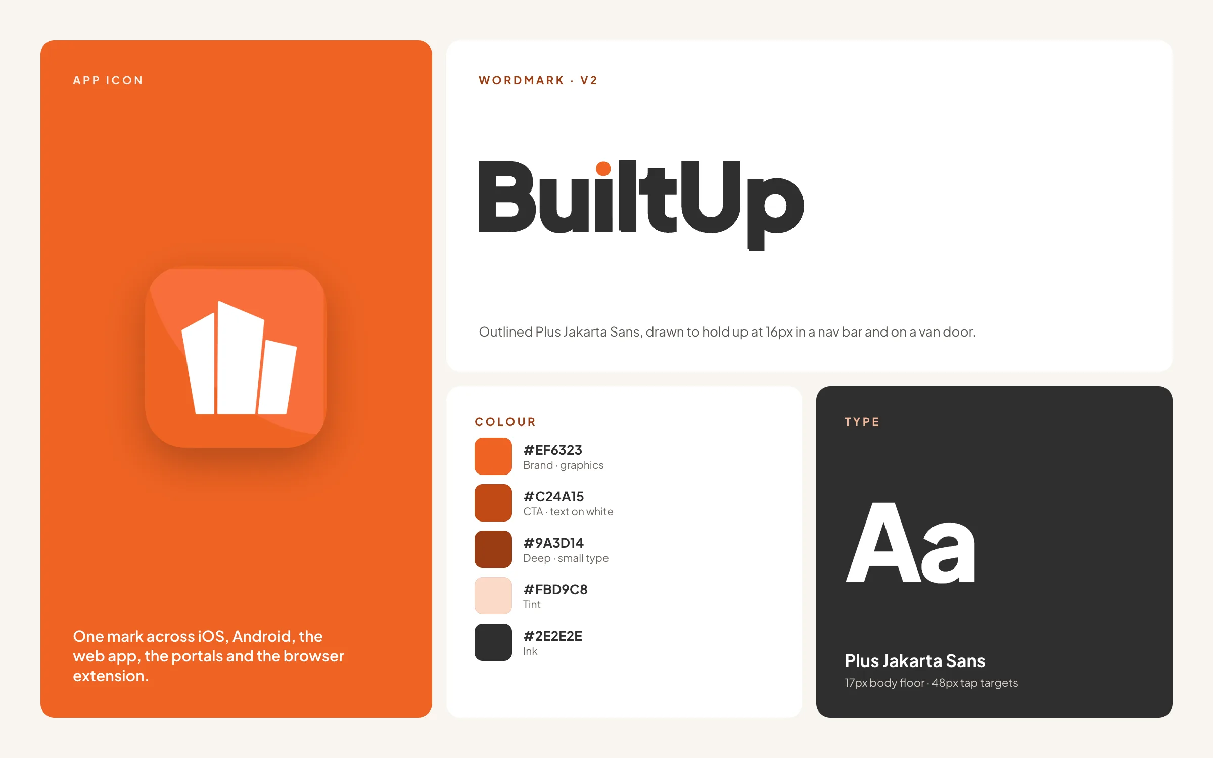
Software brands live mostly at small sizes and in interfaces. For BuiltUp we redrew the wordmark and app icon so the three-building mark holds up as a 16px favicon, and split the orange in two: a bright one for graphics only, and a deeper one that carries text, so every button and label passes WCAG AA.
- Marks tested at favicon, app-icon and social-avatar sizes before sign-off
- Colour roles defined by job, with contrast checked rather than assumed
- Tokens handed straight to the product team, because we build it too
Guidelines that let the brand outlive the agency.
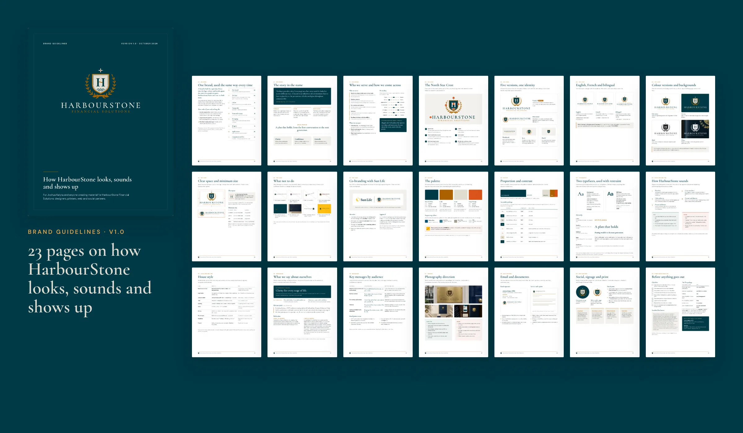
A brand that only exists in a designer's head drifts the moment someone else makes a flyer. We write the rules down: clear space and minimum sizes, colour values for print and screen, type roles, what not to do, and how the brand speaks. HarbourStone's guidelines run to 23 pages. Metal Mortgage already had a logo and a voice, but nothing written down, so every new ad was a fresh guess; we wrote an 18-page guidelines document to end that.
- Logo usage, clear space, minimum sizes and misuse examples
- Colour, typography and imagery rules with real values
- Tone of voice and messaging, where the brief includes it
From a questionnaire to files you can hand to any printer.
Questionnaire
Your story, audience, competitors and the words you want to be known for, written down before we meet.
Concepts
Genuinely different directions, each shown in use, so you choose a direction and not just a drawing.
Shortlist
You narrow it down; we tell you what each option will cost you in use, at small sizes and in print.
Refinement
Revision rounds, each answered with a full presentation, until the mark is right.
Files
Every layout, colourway and format, named and organised so anyone can find the right one.
Guidelines
The rules written down, so the brand stays consistent after we hand it over.
Common questions about branding and logo design.
Tell us what you're building. We'll tell you what it takes.
A free 30-minute call with the people who'd do the work. You leave with an honest view of scope, timeline and cost, whether or not you hire us.
- 65+ projects delivered
- 14+ years
- 6+ countries