SaaS interfaces that users actually want to use.
We design SaaS products people love. From dashboard UX to design systems, every interaction is crafted to reduce friction, increase adoption, and keep users coming back.

The working SaaS product design
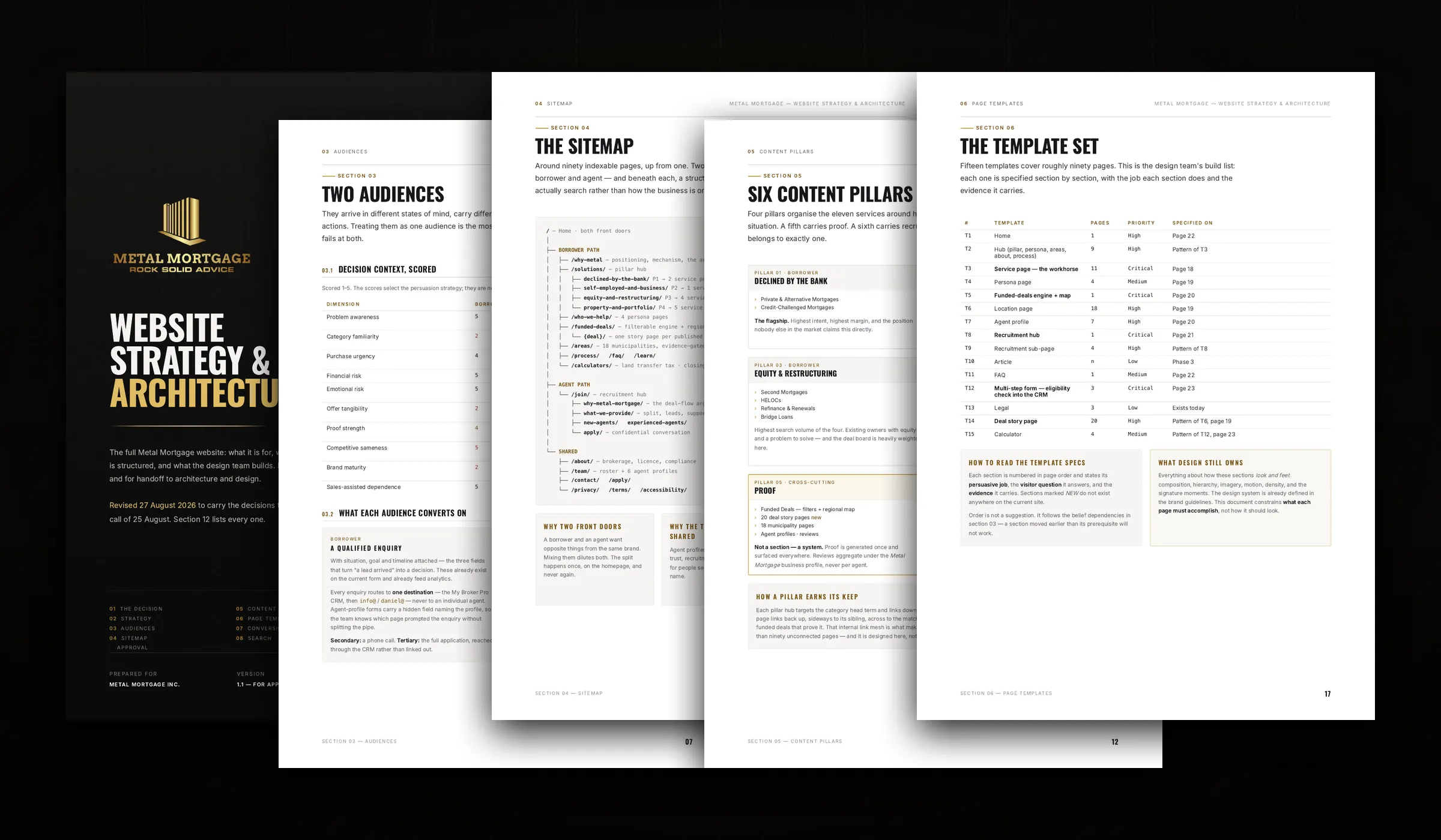
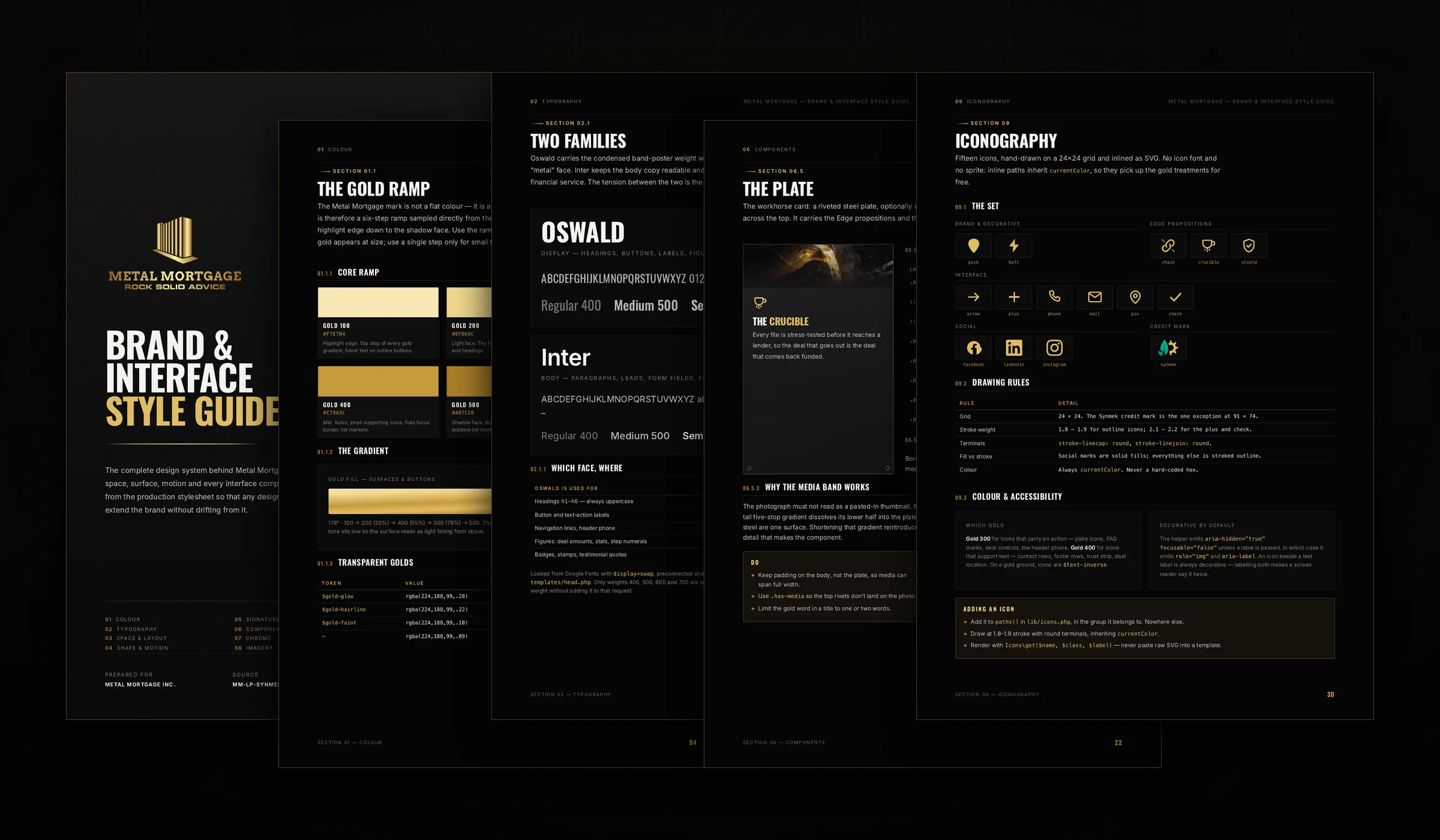
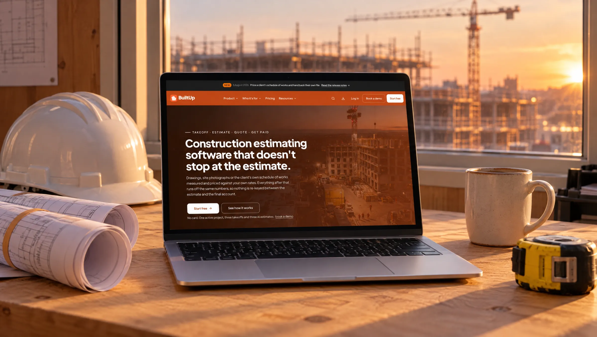
One we built: BuiltUp.
Each numbered note marks a decision we made on the real site, not a feature list.
- Design sprint
- from £10,000
- Full product design
- £20,000–£50,000
- You receive
- One flow redesigned and tested, or a full product with a documented system
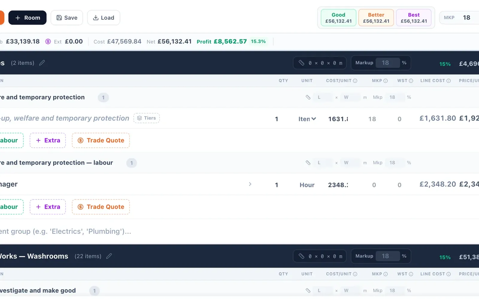
- 01Good, better and best options priced side by side on one estimate.
- 02Materials, labour, markup and profit visible on every line.
- 03One figure for preliminaries: we found the phone app at 17% and the web at 8%.
Design is the growth lever most SaaS founders underestimate.
Your product's interface is the product. When users can't find a feature, it doesn't exist. When onboarding takes too long, they churn before activation. When the dashboard feels slow, they blame the underlying data — not the rendering. Design isn't decoration. It's the difference between 5% and 50% trial-to-paid conversion.
Activation-First Onboarding
We design onboarding flows around your product's "aha moment" — the earliest point where users experience core value. Everything before that moment is friction. Everything after it is retention.
Scalable Design Systems
Component libraries, token-based theming, and documentation that lets your engineering team ship features fast without design review bottlenecks. Systems that grow with your product.
Data-Informed Decisions
We don't design by committee or personal preference. Every major design decision is validated through usability testing, heatmap analysis, and A/B experiments run on real user segments.
Understanding your users before designing for them.
Every SaaS design engagement starts with research — not wireframes. We conduct user interviews, analyse support tickets, review session recordings, and map the jobs-to-be-done your product is hired for. This research directly informs the information architecture, navigation patterns, and workflow design that follows.
- User interviews and contextual inquiry with real customers
- Jobs-to-be-done framework mapping for feature prioritisation
- Competitive UX audits across your market segment
- Support ticket analysis to identify usability pain points
- Session recording review to find drop-off and confusion patterns
Interfaces that feel as good as they look.
Beautiful SaaS interfaces aren't just about aesthetics — they signal quality, build trust, and reduce cognitive load. We design component-based systems that are consistent, accessible, and fast to implement. Every button, modal, table, and chart is part of a cohesive system, not a one-off design.
- Atomic design methodology for maximum component reuse
- Token-based colour, spacing, and typography systems
- Dark mode and theming support as standard
- Responsive layouts for desktop, tablet, and embedded contexts
- Figma component libraries with auto-layout and variants
Dashboards that drive decisions, not just display data.
Most SaaS dashboards are data dumps — tables of numbers nobody reads, charts nobody understands, and KPIs nobody acts on. We design dashboards that surface the insights that matter, hierarchy the information by importance, and make the next action obvious.
- Information hierarchy design based on user roles and goals
- Interactive data visualisations with drill-down and filtering
- Real-time widgets with contextual benchmarks and trends
- Notification and alerting systems for threshold events
- Export and reporting functionality for stakeholder communication
Research-driven design in six focused phases.
Research
User interviews, analytics review, competitive audit.
Architecture
Information architecture, user flows, navigation design.
Wireframes
Low-fidelity layouts, interaction patterns, content structure.
UI Design
Visual design, component library, interactive prototypes.
Testing
Usability testing, iteration, design system documentation.
Handoff
Developer specs, asset export, implementation support.
Your problem is probably activation, not aesthetics.
Most SaaS teams who come to us for a redesign have a churn or conversion number they are unhappy with, and have assumed the interface looks dated. Occasionally that is the problem. Far more often the issue is that new users never reach the moment where the product becomes obviously useful.
That moment has a name — activation — and it is measurable. It is the specific action, or short sequence of actions, after which a user is dramatically more likely to still be there in a month. Connecting a data source. Inviting a colleague. Completing a first real task rather than a demo one. If you do not know what yours is, that is the first thing worth establishing, because every onboarding decision follows from it.
Design work aimed at activation looks unglamorous. Removing steps rather than adding polish. Deferring settings nobody needs on day one. Replacing empty states with a path to the first useful action. Making the second session as considered as the first, since that is where most products lose people. None of it screenshots well; all of it compounds.
Our guide on SaaS onboarding covers the approach in detail.
Three ways in, depending on what you know.
Focused sprint — from £10,000
One flow, fixed timeframe. Onboarding, a specific feature, or the upgrade path. Right when you know exactly where the problem is.
Full product design — £20,000–£50,000
Research, redesign across the product, and a documented design system your engineers can build from. Right when the interface has grown without a system behind it.
UX audit
A prioritised list of what is costing you activation and retention, with effort estimates. Right when you suspect design is the problem but cannot prove it — and it is the cheapest way to find out you were wrong.
Designed to fit an engineering cycle.
Design that arrives as a finished deck helps nobody. We run a sprint ahead of your engineers so there is always specified work ready to build.
Baseline
Your activation metric, funnel data and where users currently drop out. Agreed before design starts, so success is measurable.
Research
Moderated sessions with real users. Five to eight is enough to surface most of what matters.
Flows
Structure and states before visuals — including the empty, error and loading cases that get skipped.
Interface
Visual design against realistic data volumes, not five tidy rows.
System
Components documented with states, spacing and behaviour, so engineers implement rather than interpret.
Support
We stay available through the build for the questions that always arrive once code meets design.
When design is not your problem.
A meaningful share of SaaS teams who approach us for design work have a different problem, and we would rather diagnose that in a call than after an invoice.
You are probably a good fit if:
- Users sign up and never reach the point where the product is obviously useful. That is an activation problem and design work moves it.
- Your interface grew feature by feature and now has no system behind it. That is a real design debt with real compounding cost.
- Support keeps answering the same question. Almost always an interface problem rather than a documentation one.
- You are about to build something significant and want the flow validated before engineering commits.
We are probably the wrong choice if:
- Nobody wants the product. Design cannot fix positioning. If people understand the offer and still do not want it, the problem is upstream.
- You are targeting the wrong buyer. A beautiful interface shown to someone without the problem converts no better than an ugly one.
- The product is unreliable. Fix the bugs first. No amount of interface work compensates for something that loses people's data.
- You have no way to measure the change. Without a baseline, redesign becomes a matter of taste and nobody can tell whether it worked.
We will tell you which of these you are in during the first conversation. It is a short call and occasionally it saves a lot of money.
Common questions about our SaaS design services.

Tell us what you're building. We'll tell you what it takes.
A free 30-minute call with the people who'd do the work. You leave with an honest view of scope, timeline and cost, whether or not you hire us.
- 65+ projects delivered
- 14+ years
- 6+ countries