





HarbourStone
Logo design and brand identity for HarbourStone Financial Solutions, a Sun Life advisory practice in Ontario. Nineteen concepts, three revision rounds and one crest, built to sit beside Sun Life's logo and inside Sun Life's co-branding rules. Then the full file package in English, French and bilingual, and 23 pages of brand guidelines.
A new name, and a logo that had to stand next to Sun Life's.
Joshua Kalyta is a Certified Financial Planner and a Sun Life advisor. His practice had traded as Kalyta Financial Solutions, with a poppy for a mark. It was becoming HarbourStone Financial Solutions, and it needed a logo to match. His clients are wealth-planning families and professionals: veterans, business owners, people approaching or in retirement, and families of children with disabilities.
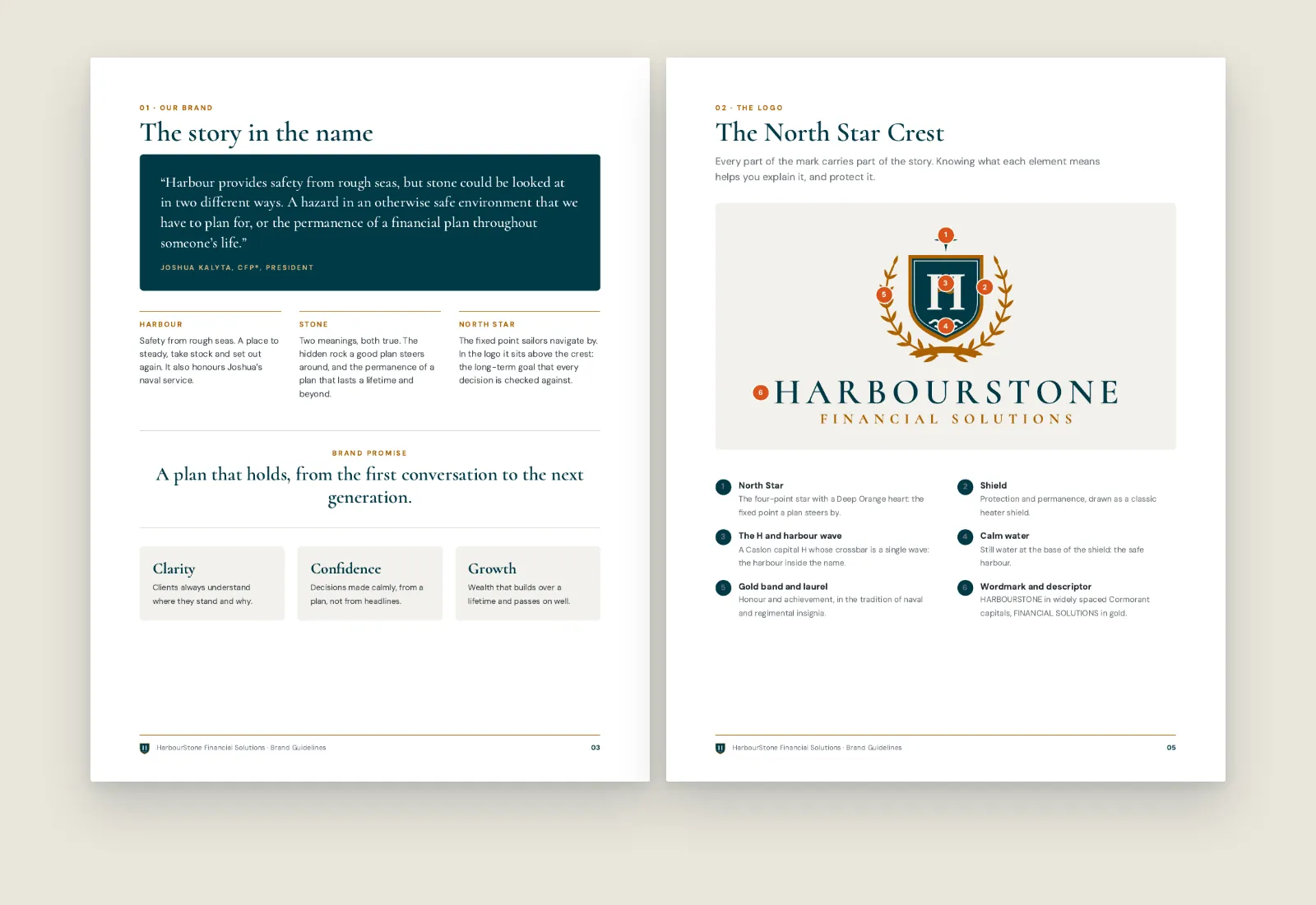
The name came with a story. A harbour is safety from rough seas, and it nods to Joshua's naval service. A stone can be read two ways: a hidden hazard a good plan steers around, or the permanence of a plan that lasts a lifetime. The logo had to carry that story, look trustworthy and authoritative, and work at 16 pixels in a browser tab and two metres wide on a sign. Because it would appear in Sun Life co-branded material, it also had to follow Sun Life's co-branding rules, and Sun Life's brand team has the final say.
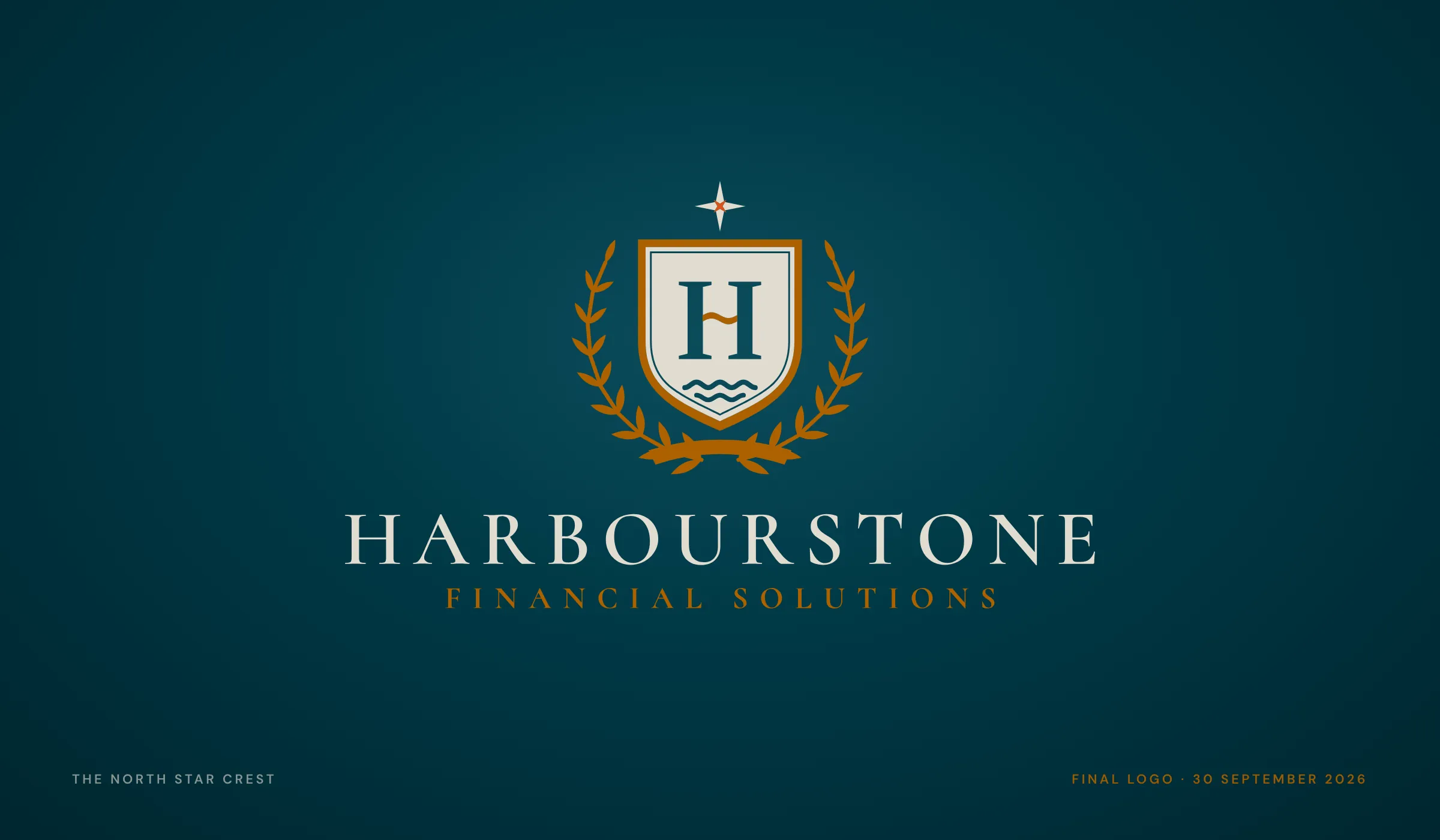
An advisor's logo sits beside one of the best-known names in Canadian finance. It has to hold its own there, using only the colours that name allows.
We started with Joshua's own words, not a mood board.
Every logo package we offer runs the same five steps: discovery, research, concepts, refinement and delivery. Discovery is a brand questionnaire. Joshua's answers became the first page of every concept presentation, so each design could be checked against what he had actually said.
- A brand personality, scoredTen scales from Classic–Modern to Corporate–Personal. His strongest answers: serious, exclusive and premium, then bold and personal. As a person, the brand is "elegant and well spoken, but open to new ideas"
- Three words to design toClarity, Confidence and Growth
- Who it is forVeterans, business owners, pre-retirees and retirees, and families of children with disabilities
- What sets the practice apartThe planning process leads and products follow. Integrity, high-touch service, and nothing generic

Sun Life's secondary palette, and nothing else.
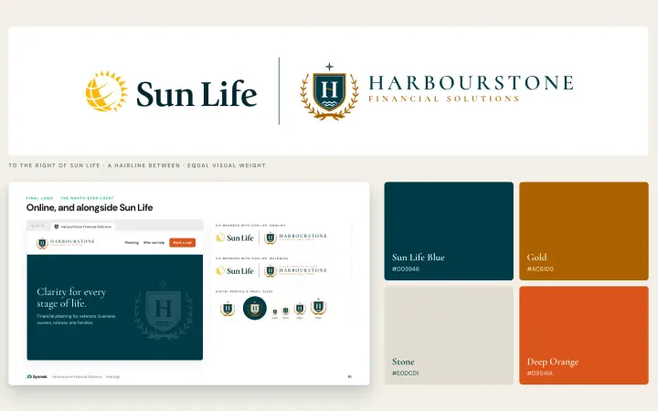
Sun Life's co-branding specification decides a lot before a single line is drawn. The advisor's logo may only use Sun Life's secondary palette. It sits to the right of the Sun Life logo, divided by a hairline, at equal visual weight. It needs vertical, horizontal, icon and wordmark versions in full colour, inverse, black and white. We added one rule of our own: no sun or sunrise imagery that could be confused with Sun Life's mark.
- Sun Life Blue#003946Shield, wordmark, main ink
- Gold#AC6100Laurel, band, wave, descriptor
- Stone#E0DCD1The shield on dark grounds
- Deep Orange#D9541AThe heart of the North Star only
- Medium Blue#004F73Supporting
- Light Blue#38758ESupporting
- Warm Grey#A59E8CSupporting
- Mist#DDE6E1Supporting
- Sun Life Yellow#FEBE10Never. It belongs to Sun Life's own logo
The four colours in the logo are marked. The supporting colours are for charts and tables, never the logo.
Nineteen ways to tell the HarbourStone story.
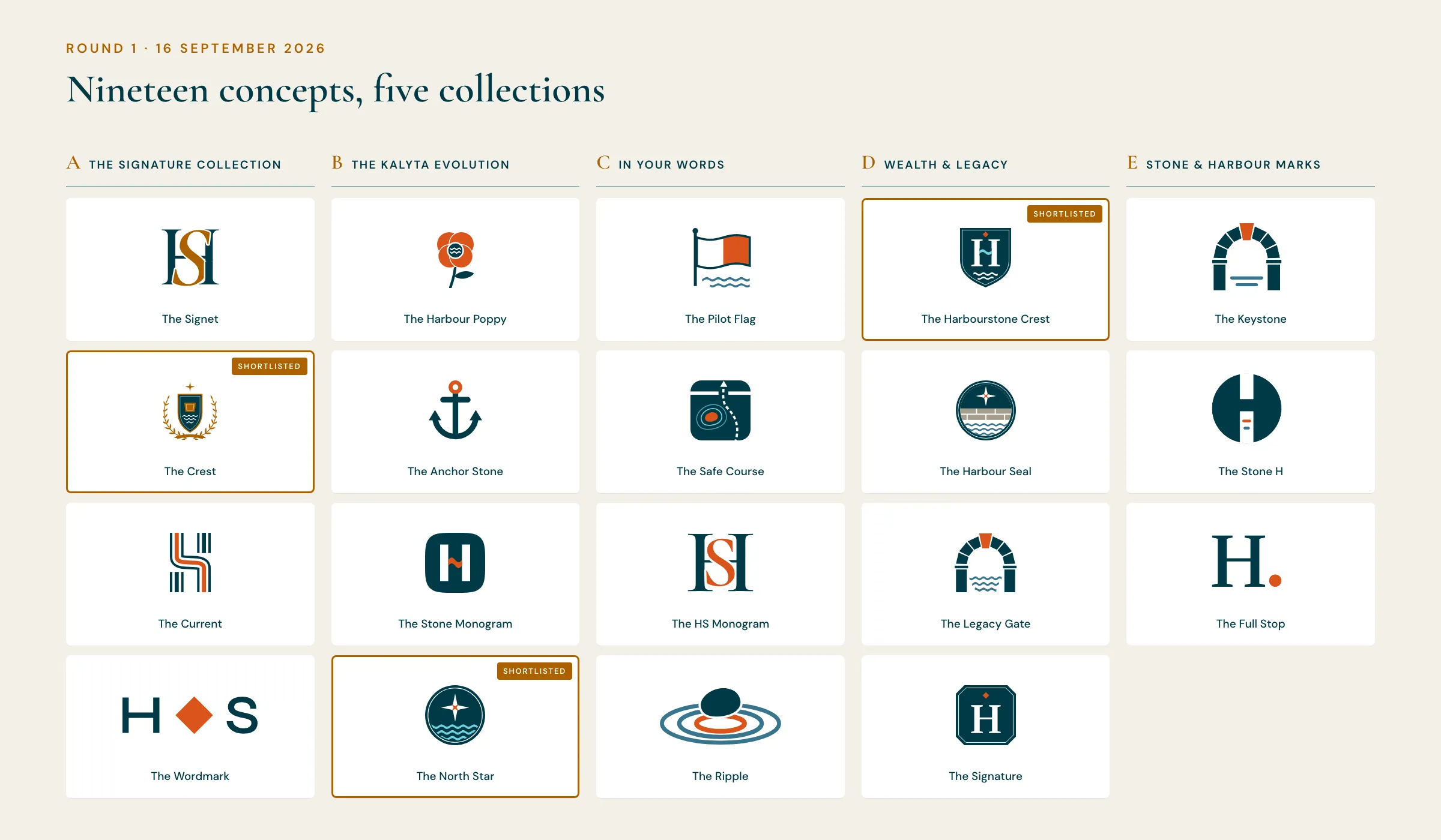
A concept, in our proposals, is a distinct idea, not a colour swap of the same one. Round 1 brought them together in one 121-slide presentation: 19 concepts in five collections, so Joshua could compare whole directions before comparing details.
- A · The Signature CollectionMonograms, heraldry and custom lettering, to the standard of a private bank: The Signet, The Crest, The Current, The Wordmark
- B · The Kalyta EvolutionCleaner, modern marks a Kalyta client would still recognise: The Harbour Poppy, The Anchor Stone, The Stone Monogram, The North Star
- C · In Your WordsBuilt strictly from the questionnaire: The Pilot Flag (the code flag for "pilot on board"), The Safe Course, The HS Monogram, The Ripple
- D · Wealth & LegacyTrusts, inheritance and the next generation: The Harbourstone Crest, The Harbour Seal, The Legacy Gate, The Signature
- E · Stone & Harbour MarksThe plainest geometric answers: The Keystone, The Stone H, The Full Stop

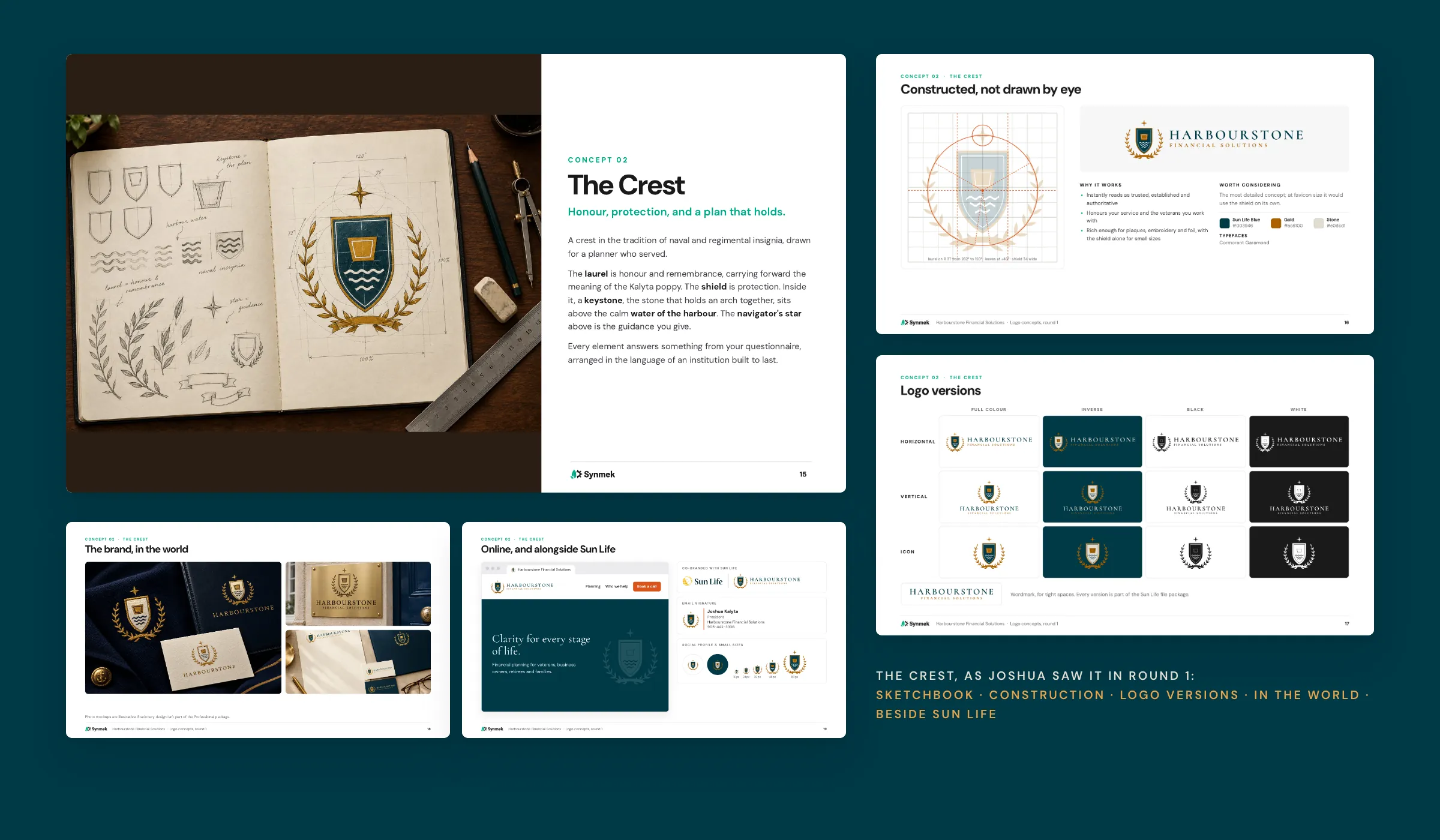
A logo is easier to judge on a door plate than on a white slide.
Each concept had the same five pages, so none was presented better than another. The logos are constructed vectors drawn in code, never image-model output. The sketchbook and the scenes around them are generated images with the real vector logo placed in, and we labelled them as illustrative in every deck.
- The ideaA sketchbook page and the story: what each element means and which answer in the questionnaire it comes from
- Constructed, not drawn by eyeThe grid and geometry, with what works and what is worth considering, including how it behaves at favicon size
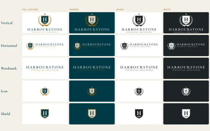
- Logo versionsHorizontal, vertical and icon in full colour, inverse, black and white, the grid Sun Life asks for
- In the world, and beside Sun LifeSignage and stationery scenes, then a website header, an email signature and the co-branded lockup
- 16 tagline optionsCollected on one page for Joshua to react to, alongside the concepts
Joshua didn't pick one concept. He picked three, and told us exactly which part of each to keep.
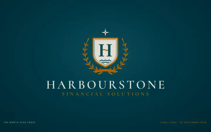
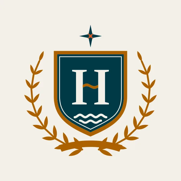
The North Star Crest.
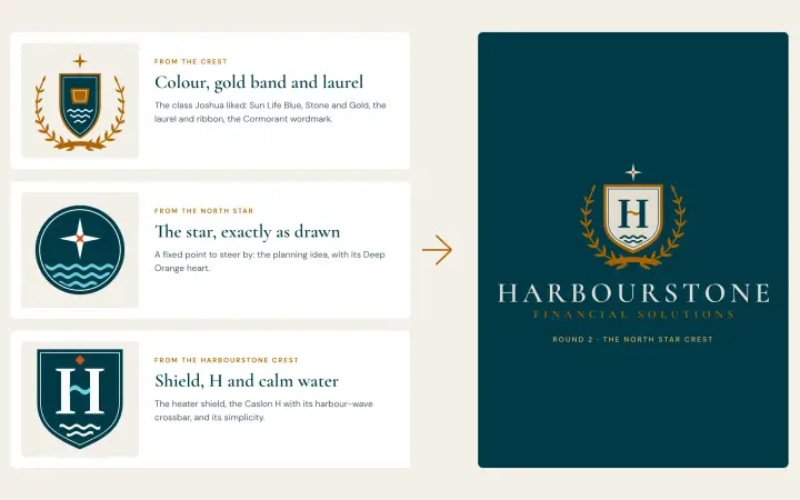
From The Crest he loved the class: the colours, the gold band and the laurel, though the centre felt a little plain. The North Star was the strongest idea, direction tied to the planning he does, but it needed to feel classier. The Harbourstone Crest had the simplicity he wanted, in the wrong colours. We merged them by reusing each part exactly as drawn, not by redrawing a lookalike.
- From The Harbourstone CrestThe heater shield, the Caslon H with its harbour-wave crossbar, and the calm water in its base
- From The CrestThe colour roles, the laurel and ribbon, the gold band round the shield and the Cormorant wordmark
- From The North StarThe four-point star with its Deep Orange heart, now above the H, so the brand's main idea sits at the top of the crest
- Room to shiftThree versions of the same crest: the star inside the shield above the H, exactly as he described it; the star above the shield; and a simplest version without the water

Three revision rounds, each one a direct answer to Joshua's feedback.
The package included three rounds of revisions. Every round came back as a presentation in the same format as round 1, opening with what Joshua had asked for and what we changed, so the decision trail is on paper.
 Round 1 · 16 September
19 concepts, five collections
- Joshua chose
- A shortlist of three: The Crest, The North Star and The Harbourstone Crest, and how he'd combine them.
- Round 2 · 25 September
The North Star Crest
- We changed
- Merged the three concepts. Offered three versions, two proposed taglines, and the crest drafted in Canadian French.
- Joshua chose
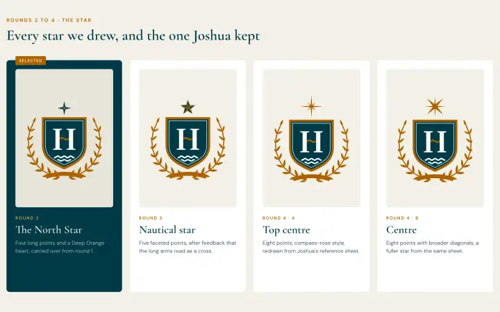
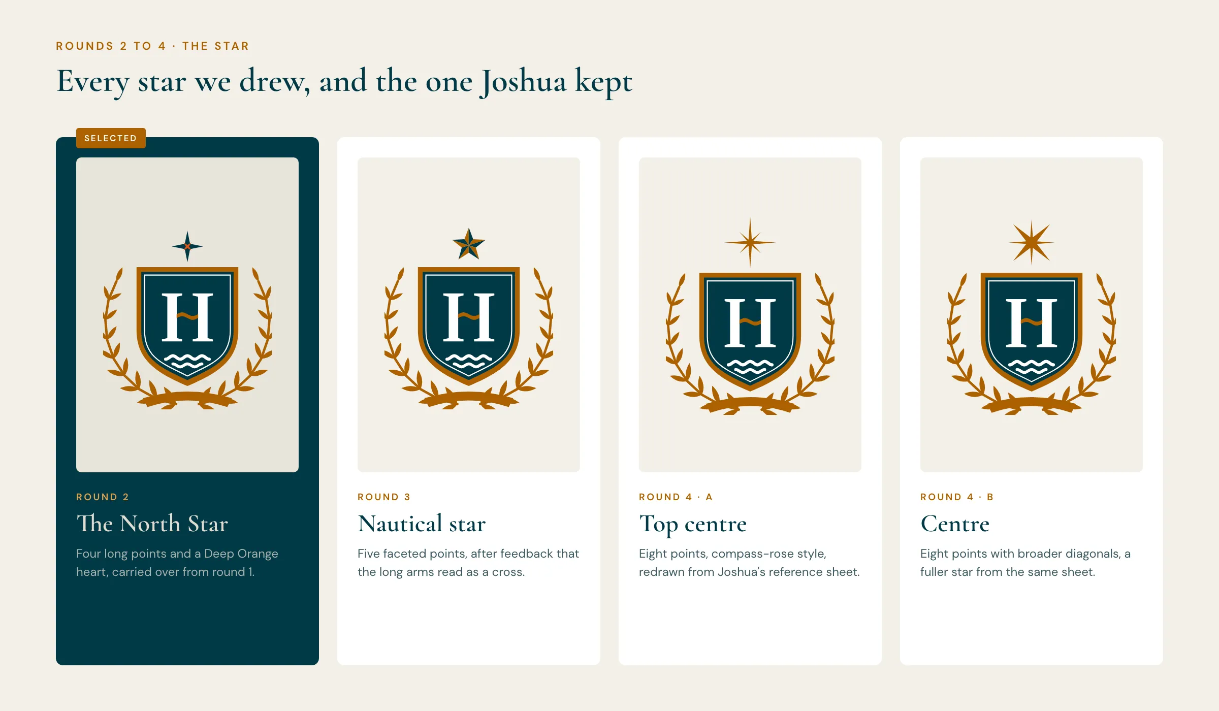
- The star above the crest. He asked for English, French and bilingual versions, and a star that looked "more like a star and less religious".
- Round 3 · 28 September
A nautical star, three languages
- We changed
- A faceted five-point nautical star, the sailor's sign for finding your way home. English (primary), French and bilingual lockups in every colour version.
- Joshua chose
- Not the nautical star. He sent a sheet of reference stars and named two. For the bilingual version, he wanted French above the name and English below.
- Round 4 · 29 September
His two stars, redrawn
- We changed
- Both stars redrawn as clean vectors, measured point by point from his image and made a touch bolder so the fine points hold on a business card. Solid gold. Bilingual order swapped.
- Joshua chose
- Neither. Seeing them on the crest settled it: the round 2 star was the best.
- Final · 30 September
The original North Star, restored exactly
- We delivered
- Round 2's star, put back exactly as first drawn, with round 4's English, French and bilingual lockups. Then the full file package, packed for Sun Life.
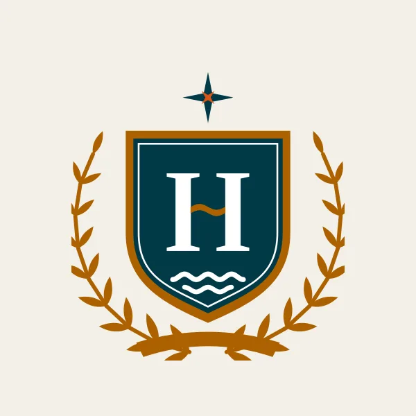


Six parts, each one carrying part of the story.
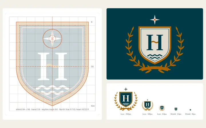
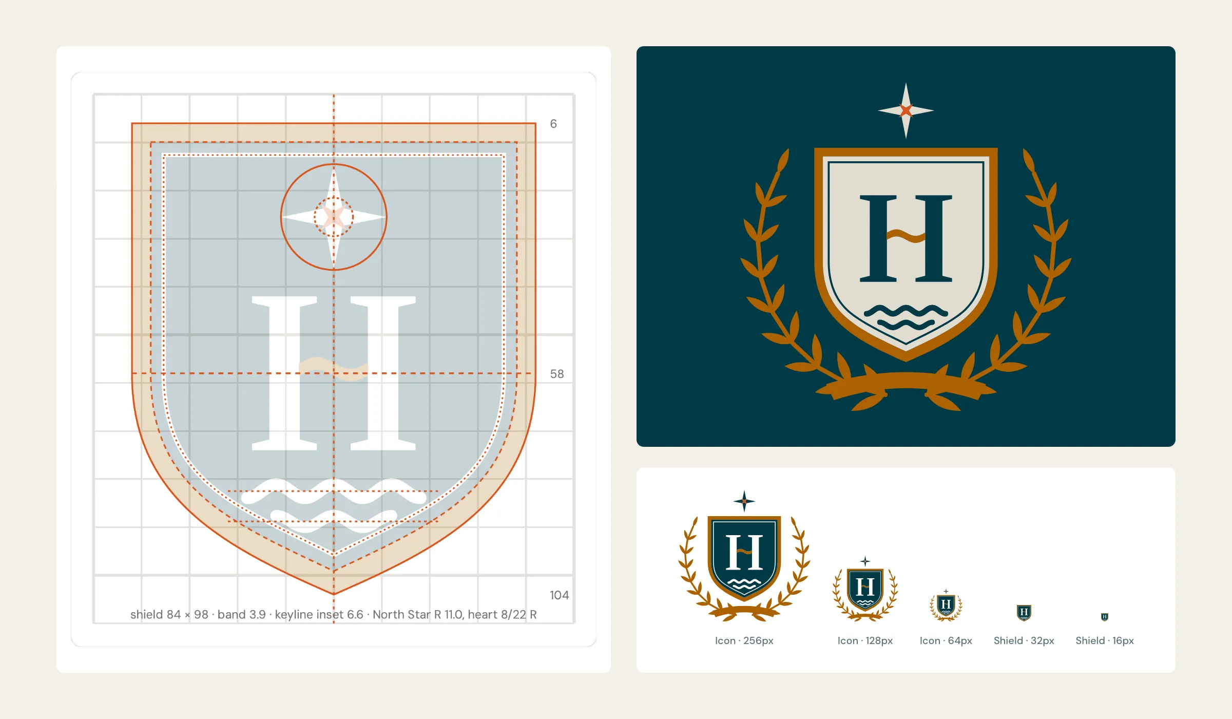
The crest is built on a measured grid, not traced by eye: a shield 84 by 98 units, a gold band 3.9 units wide, a keyline inset 6.6, the star on an 11-unit radius. That precision is what lets one drawing work as a gold-foil folder and as a 16-pixel favicon.
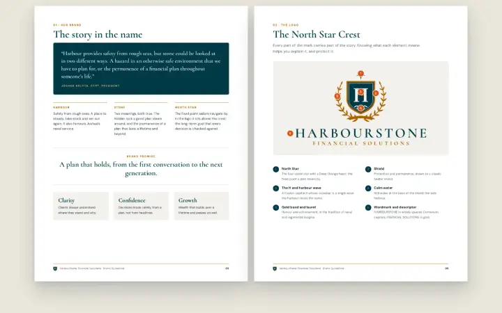
- The North StarFour points with a Deep Orange heart: the fixed point a plan steers by
- The shieldProtection and permanence, drawn as a classic heater shield
- The H and harbour waveA Libre Caslon capital H, redrawn so its crossbar is a single wave: the harbour inside the name
- Calm waterStill water in the base of the shield: the safe harbour
- Gold band and laurelHonour and achievement, in the tradition of naval and regimental insignia, and a nod to the remembrance poppy of the old Kalyta mark
- Wordmark and descriptorHARBOURSTONE in widely spaced Cormorant capitals, FINANCIAL SOLUTIONS in gold
One crest, three lockups, set to the same weight.
Canadian clients and Sun Life material can need French. The crest and the name never change. Only the descriptor does, and in the bilingual version both descriptors are set at the same size so neither language looks secondary.
- English (primary)FINANCIAL SOLUTIONS, the version HarbourStone uses day to day
- FrenchSOLUTIONS FINANCIÈRES, in French word order and keeping its accent in capitals, as the Office québécois de la langue française recommends
- BilingualSolutions financières above the name and Financial Solutions below, the order Joshua asked for


Designed to pass Sun Life's brand review, then packed for it.
Every concept from round 1 onwards was shown in the co-branded lockup, so nothing reached the shortlist that couldn't sit next to Sun Life. The four colours in the crest all come from Sun Life's secondary palette, and the one-colour versions print as pure black or white.
- The lockupHarbourStone to the right of Sun Life, separated by a hairline rule, sized by eye so neither logo dominates
- No Sun Life yellow, no sunriseTheir primary yellow is reserved for their own logo, so it appears nowhere in HarbourStone material
- Submission zipsOne zip per language, packed exactly as Sun Life's specification asks: their folder structure, .ai and .jpeg files, each under 10 MB
- Approval sits with Sun LifeSun Life Brand must approve the logo before it appears in co-branded material. The files were prepared for that review; approval is theirs to give

Every file a printer, sign maker or web developer will ask for.
Logo projects often end with a single PNG and a font name. HarbourStone's package follows Sun Life's co-branding file structure and naming pattern, so the right file is findable without a call to the designer.
- 360logo files: 3 languages × 5 layouts × 4 colourways × 6 formats
- CMYK.ai, .eps and PDF/X-4 for print, written by script and saved through Illustrator
- RGB.svg for the web, 3000 px transparent .png, and .jpeg on its background
- Real cut-outsThe H, keyline and water are knocked out, not filled white, so any background shows through
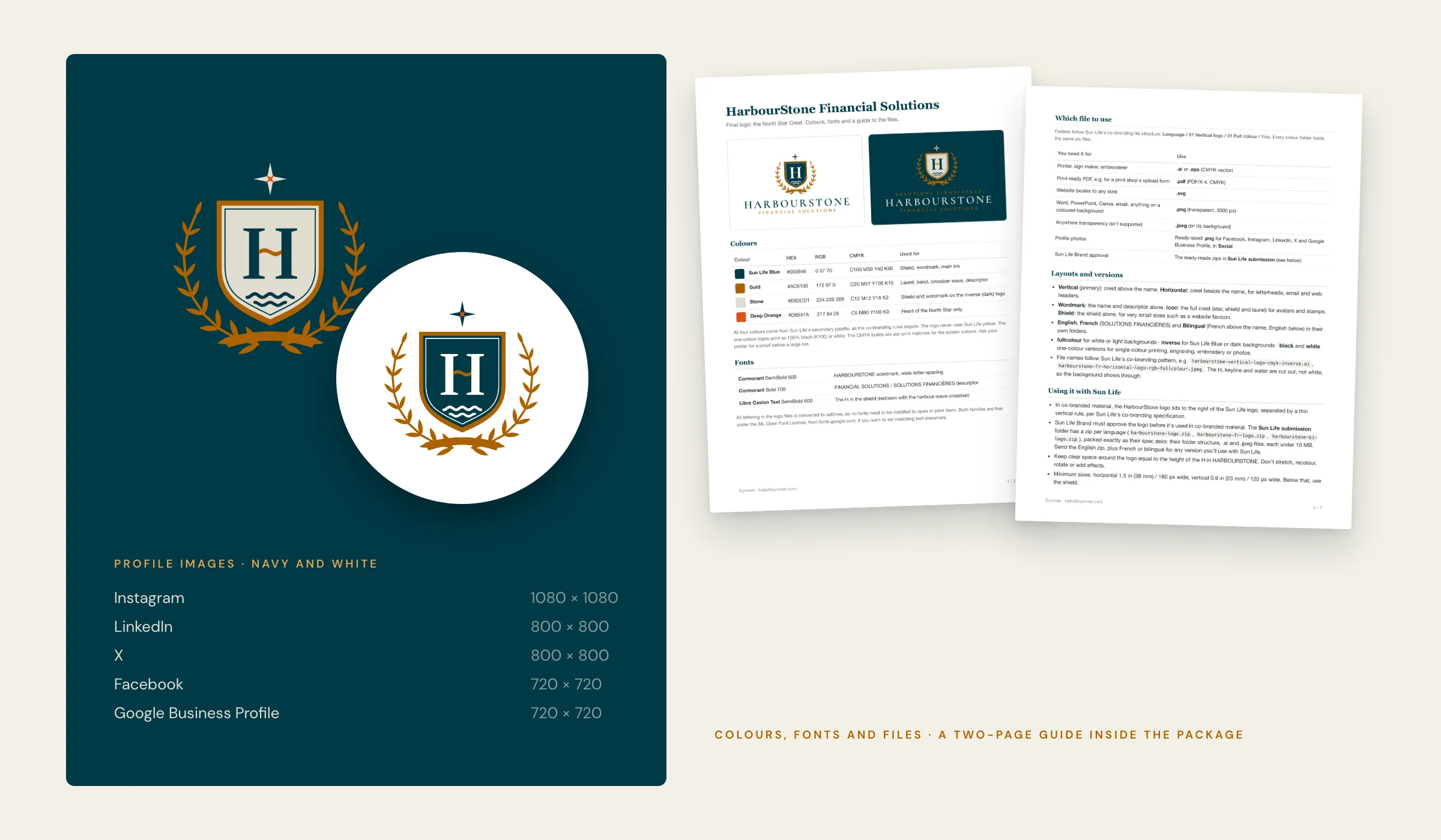
- 10ready-sized profile images, plus a two-page colours, fonts and files guide
English/  French/  Bilingual/
├── 01 Vertical logo/
│   ├── 01 Full colour/
│   │   ├── harbourstone-vertical-logo-cmyk-fullcolour.ai
│   │   ├── harbourstone-vertical-logo-cmyk-fullcolour.eps
│   │   ├── harbourstone-vertical-logo-cmyk-fullcolour.pdf
│   │   ├── harbourstone-vertical-logo-rgb-fullcolour.svg
│   │   ├── harbourstone-vertical-logo-rgb-fullcolour.png
│   │   └── harbourstone-vertical-logo-rgb-fullcolour.jpeg
│   ├── 02 Black/
│   ├── 03 White/
│   └── 04 Inverse/
├── 02 Horizontal logo/
├── 03 Icon/
├── 04 Wordmark/
└── 05 Shield (small sizes and favicon)/
Social/         10 profile images
Mockups/        signage · stationery · social
Sun Life submission/
├── harbourstone-logo.zip
├── harbourstone-fr-logo.zip
└── harbourstone-bi-logo.zip
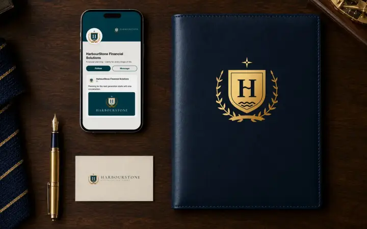
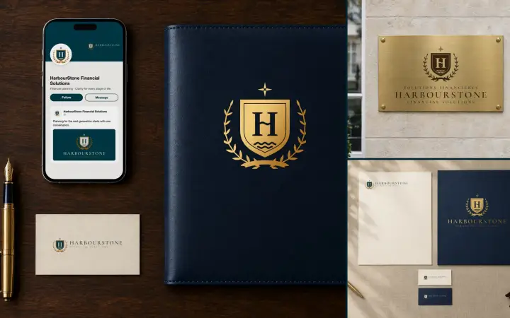
Harbourstone-Colours-Fonts-and-Files.pdfGold foil on a leather folio, engraved brass by the front door, a LinkedIn profile. The crest had to look like it belonged in every one.

The real logo in every scene, never an AI's version of it.
Image models are good at a leather folio and bad at a logo: they redraw it, and a client signs off on something that doesn't exist. So we generated the scenes blank, square to the camera, and composited the real vector logo into them: printed with a multiply blend on paper, foiled or engraved from the logo's own ink mask, and the phone screen rendered as HTML. Profile images and mockups always show the full crest with its star and laurel, never a cut-down.
- Three mockups in the packageSignage, stationery, and social and merchandise, for Joshua to use when showing the new brand
- Profile images, ready to uploadInstagram, LinkedIn, X, Facebook and Google Business Profile, each at the platform's own size, in navy and in white
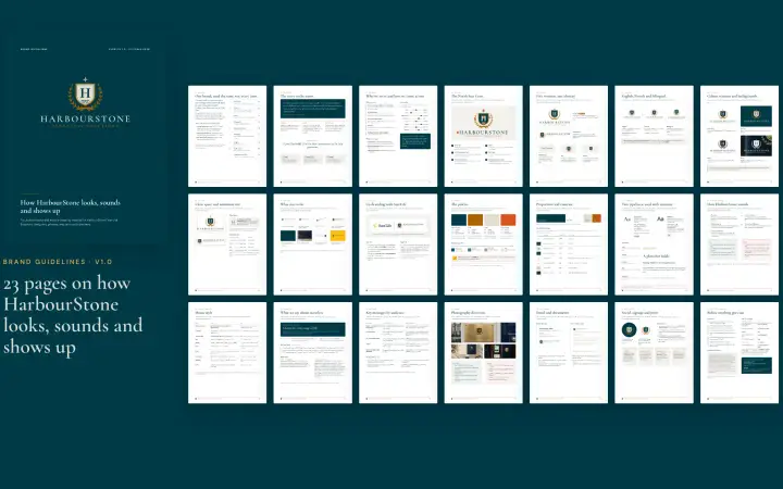
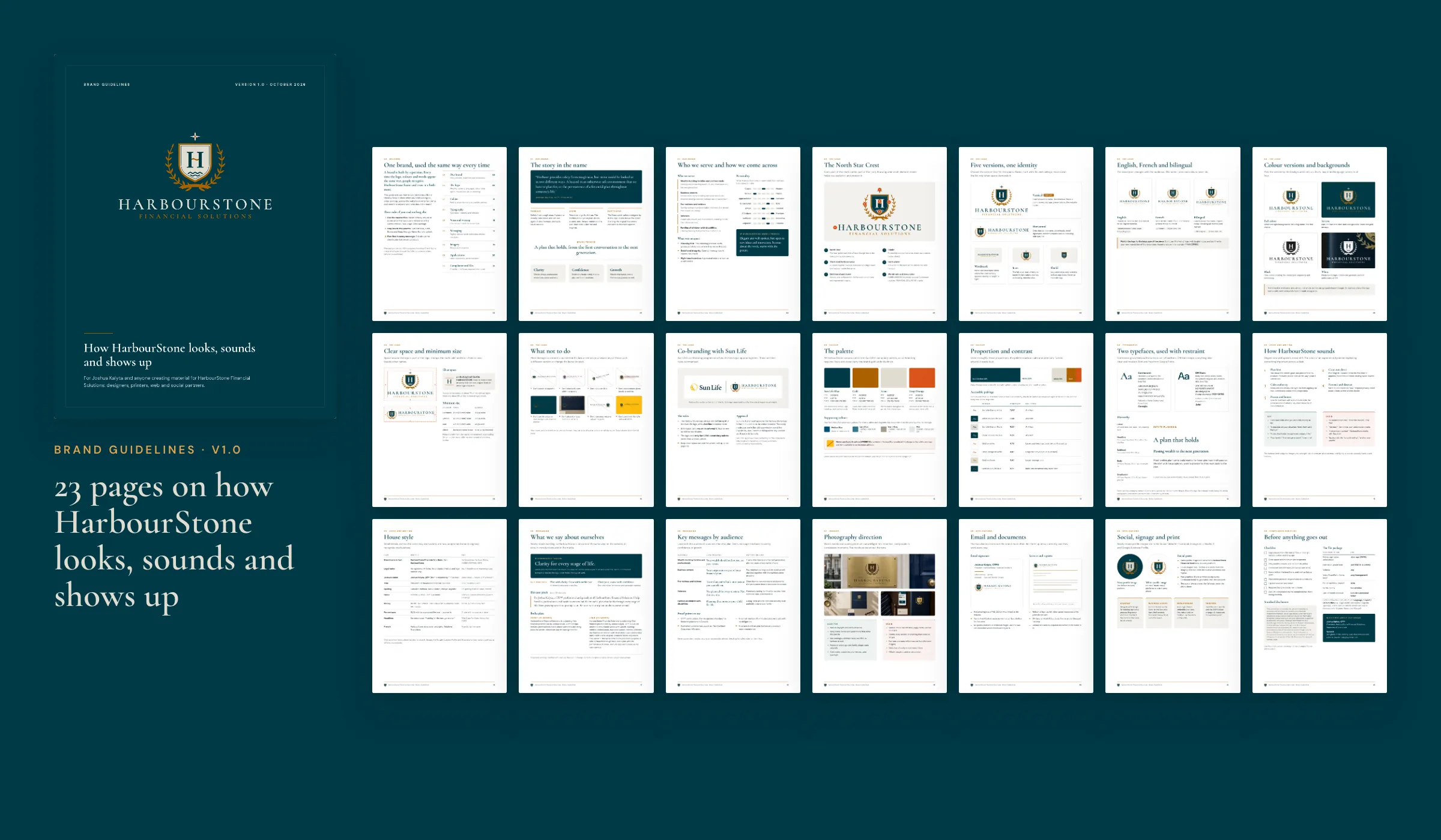
23 pages so the brand looks the same whoever makes the next thing.
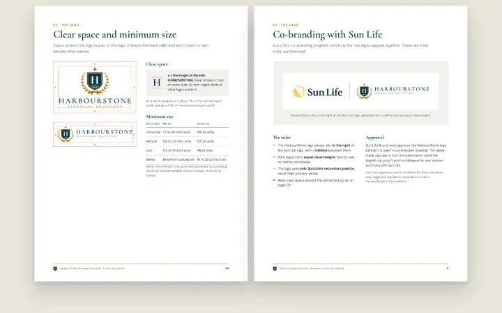
Two days after the final files, we delivered the brand guidelines: one document for Joshua and for anyone producing material for HarbourStone, from printers to web and social partners. It is built from the same SVGs as the file package, so the logo on every page is the real one.
- The story and the logoThe name, the brand promise, who HarbourStone serves, the anatomy of the crest, the five layouts, the three languages and which version goes on which background
- Rules you can measureClear space equal to the height of the H, minimum sizes in inches, millimetres and pixels, a page of what not to do, and Sun Life's co-branding rules summarised
- Colour and typeHEX, RGB and CMYK for every colour, accessible text pairings with contrast ratios, Cormorant and DM Sans with Georgia and Arial fallbacks for Office
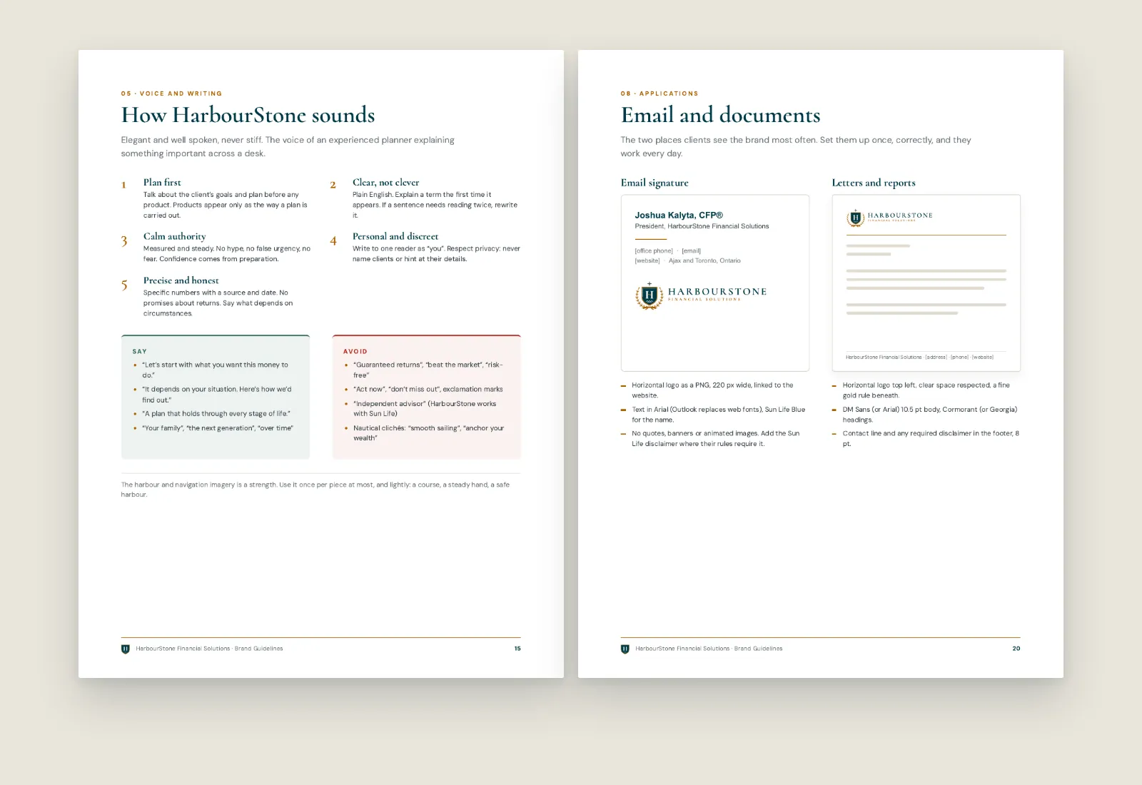
- Voice and messaging (proposed)Five voice principles, a house style, things to say and avoid, key messages by audience, and a proposed tagline, all pending Joshua's review and Sun Life compliance
- Applications and a checklistPhotography direction, email signature, letters, social, signage and print, and a checklist to run before anything goes out
Written for the person who opens it with a deadline.


A brand identity, from a questionnaire to a submission-ready package.
These are counts of what was made, taken from the project files. The brand is new and still with Sun Life for co-branding approval, so there are no results to report yet.