Over the last decade, the internet has become an essential part of our daily lives. Yet, despite the fast-paced advancement of technology, web design seems to have stalled. Many websites today look and function remarkably similarly, lacking the creativity and dynamism they once had. Whether it’s e-commerce, news portals, or even personal blogs, there’s a growing sense of sameness: repetitive layouts, overused design elements, and predictability that leaves users bored.
This stagnation has broader implications, especially as users expect more from their online experiences. It’s not enough for a website to simply exist anymore—it must engage, inform, and adapt. The future of the web depends on breaking free from these outdated conventions and embracing innovation. In this article, we’ll explore how web design can evolve, introducing fresh ideas to improve user experience (UX) and push the boundaries of what websites can offer.

The Problem: Websites Have Become Stale and Predictable
There was a time when every new website felt unique. The early 2000s saw a boom in creative web design, with designers experimenting with different layouts, colours, and interactive features. Today, however, the web is dominated by templates and safe design choices. The rise of website builders like WordPress, Wix, and Squarespace has standardised design, making it easier for non-developers to create websites—but also leading to an oversaturation of sites that look and function the same.
Take the classic “hamburger menu” used on almost every mobile site, or the ubiquitous grid of cards for displaying content. These patterns are so common that users now anticipate them, but while familiarity has its advantages, it’s also contributing to a lack of excitement in how we experience the web. The challenge is clear: how do we shake up web design while still keeping usability at the forefront?
1. The Rise of Micro-Personalisation: A User-Centred Approach
One key to overcoming the sameness of modern websites is micro-personalisation. While personalisation has been a buzzword in web design for years, it has often been broad and impersonal. Think of the recommendation algorithms on retail websites or streaming platforms that suggest products or shows based on your browsing history. Although useful, these features are far from innovative.
In the future, websites need to take personalisation to the next level. Micro-personalisation means customising the user experience down to the smallest details—based not just on past behaviour, but on real-time data like location, time of day, or even the user’s mood. For example, a news site could automatically adjust its homepage to show stories relevant to your local area, or an e-commerce site might highlight certain products based on the weather in your location.
A great example of this trend is Netflix, which constantly tweaks its interface based on individual preferences, showing users different thumbnail images for the same film depending on what genres they typically watch. In the same way, future websites could adapt to create an environment that feels unique to each visitor.
For this to succeed, websites need to invest in more sophisticated AI and machine learning tools to process user data in real time. Not only would this improve the UX, but it would also deepen user engagement by creating a web experience that feels intuitive and personal.
Recommended Reading: Human Emotion in Web Design: How It Can Boost Conversions and User Experience
2. Rethinking Navigation: Gesture-Based Interactions
Navigation is another area where web design has grown stagnant. Most websites rely on standard navigation bars or scroll-based interaction to guide users through content. While these methods are tried and tested, they no longer offer much in the way of excitement. This is where gesture-based interactions could be transformative.
Gesture-based interactions allow users to control web interfaces with swipes, taps, pinches, or other physical gestures—much like how you would interact with a mobile app or a touchscreen device. This approach opens up a whole new level of interactivity, making websites feel more dynamic and engaging. It’s particularly effective for mobile-first websites, where swiping and scrolling are already ingrained user habits.
For instance, imagine a travel website where you could swipe between different destination options or “flick” through photo galleries rather than clicking through pages. Gesture-based navigation also has potential for creative industries, where interactive portfolios or immersive storytelling could become more engaging through intuitive gestures.
A notable example of this is Awwwards, a platform showcasing cutting-edge web design. Many of the websites featured on Awwwards make use of innovative navigation methods, including gestures and motion-driven interactions. These sites break away from traditional, static designs, offering a glimpse into what the future could look like.

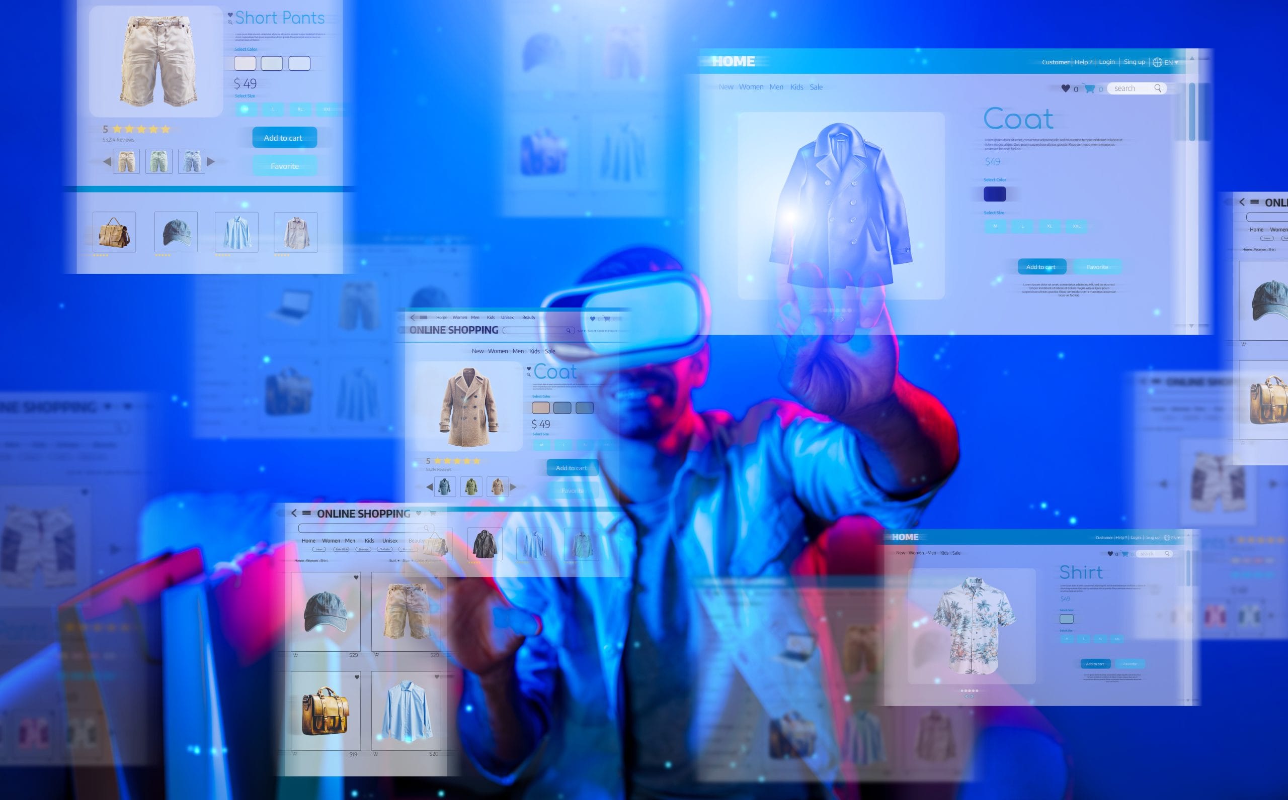
3. Augmented Reality (AR) and Virtual Reality (VR): The Next Frontier of Web Design
While augmented reality (AR) and virtual reality (VR) have gained traction in gaming and entertainment, they’ve been slower to make their mark in mainstream web design. However, as AR and VR technologies become more affordable and accessible, the potential for immersive web experiences is enormous.
Imagine shopping for furniture online and being able to place a virtual model of a sofa in your living room to see how it fits. This type of interactive experience isn’t just possible; it’s already happening. IKEA’s AR app, for example, allows users to visualise furniture in their own space through their smartphone’s camera, bridging the gap between online browsing and in-person shopping.
Beyond retail, AR and VR can enhance websites in fields like education, real estate, and travel. An educational website could offer 3D models of ancient artefacts for students to explore, or a real estate platform could provide virtual house tours that make buyers feel like they’re walking through a property. For travel, VR could allow users to “visit” a destination before booking a trip, providing a far richer experience than static photos or videos ever could.
These immersive technologies will likely become even more common as 5G networks roll out globally, offering the bandwidth and low latency needed to power high-quality AR and VR experiences on the web. For web designers, the key will be to integrate these technologies seamlessly, creating immersive yet user-friendly sites that offer real value to visitors.
4. Striking a Balance: Minimalism with Functionality
Minimalist design has been a dominant trend in web design for years, and for good reason. Clean, uncluttered layouts are not only visually appealing, but they also improve readability and make navigation easier. However, as the trend towards minimalism has grown, some websites have gone too far, sacrificing functionality in the name of aesthetics.
The future of minimalist web design should focus on functional minimalism—a balance between simplicity and utility. It’s about stripping away unnecessary elements without compromising the site’s usability. For example, a minimalistic landing page should still provide clear, easy-to-find call-to-action buttons, search functionalities, and navigation tools.
One company that strikes this balance well is Apple. The tech giant is known for its sleek, minimalist website designs, but their pages are also highly functional. Visitors can quickly navigate to product details, make purchases, or find support without being overwhelmed by too much content or excessive design elements.
Incorporating this approach means web designers should focus on intuitive navigation, clear typography, and optimised images that load quickly. It’s about creating a smooth user experience while maintaining a visually appealing, modern design.
5. Speed and Performance Are Paramount
It doesn’t matter how visually stunning or innovative a website is if it takes too long to load. Users today have high expectations when it comes to performance, and slow load times are one of the quickest ways to lose visitors. According to research by Google, as page load time goes from 1 second to 3 seconds, the probability of a user bouncing increases by 32%. By the time it reaches 5 seconds, that number jumps to 90%.
Web designers must prioritise speed and performance as foundational elements of their work. This means optimising images and videos, minimising the use of large files, and implementing caching strategies to ensure that websites load as quickly as possible. Another approach is embracing Progressive Web Apps (PWAs), which offer fast, app-like experiences without the need for users to download an actual app. PWAs load almost instantly, even in areas with poor connectivity, making them ideal for mobile users.
Additionally, websites need to adopt mobile-first design principles. More people are browsing the web on mobile devices than ever before, and if a site doesn’t perform well on mobile, it’s likely to lose out on a huge portion of its audience. Responsive design, fast-loading mobile pages, and easy-to-navigate interfaces are all essential for future-proofing websites in a mobile-first world.
Embracing Innovation for a Dynamic Web Future
The web doesn’t have to be stale or repetitive. By embracing new technologies and innovative design principles, websites can evolve into dynamic, engaging platforms that offer users unique, immersive experiences. Personalisation, gesture-based navigation, AR/VR, functional minimalism, and speed optimisation are just a few of the many strategies that can break the cycle of sameness in web design.
It’s time to move beyond static, predictable layouts and explore the potential that lies ahead. As technology continues to advance, so must web design—focusing on creating fresh, exciting digital experiences that meet the needs and expectations of today’s users.
By adopting these forward-thinking ideas, designers and developers can ensure that the web remains an engaging, interactive, and indispensable part of our lives.