Table of Contents
- Introduction to Bento Design
- What Is Bento Design?
- Bento Design in 2026: Still Worth Using?
- Benefits of Bento Design for Websites
- User Intuitiveness in Bento Design
- Examples of Sites That Implement Bento Design
- How to Build a Bento Grid (With Code)
- When Not to Use Bento Design
- Why Bento Design Offers a Better User Experience
- Conclusion
Introduction to Bento Design
Web design is continuously evolving, and as users demand cleaner, more organized, and visually appealing interfaces, Bento design has matured from a trend into a modern standard. Inspired by the traditional Japanese lunch box, which offers a harmonious combination of different dishes within one container, Bento design for websites represents an organized, content-rich, modular layout that is both visually engaging and highly practical. This guide covers what Bento design is, its benefits, how to build one properly, where it goes wrong, and why it continues to deliver an improved user experience in 2026.
What Is Bento Design?
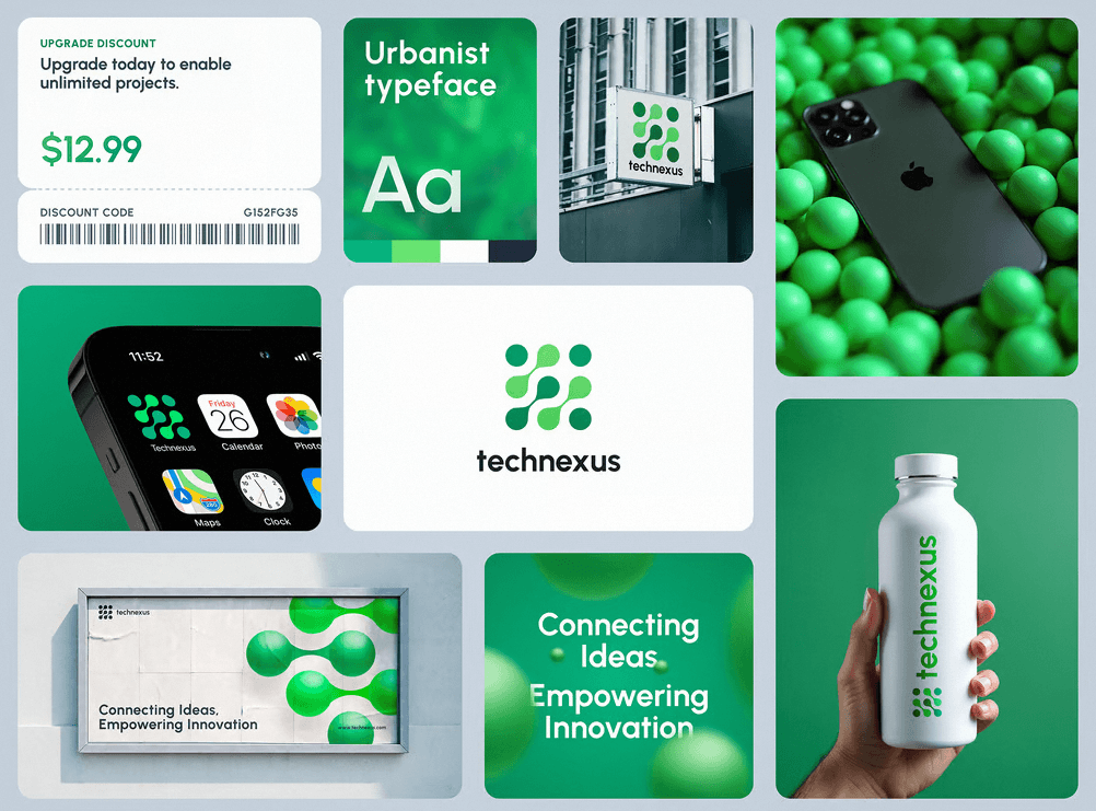
Bento design refers to a grid-based layout that presents content in visually distinct, separate modules or blocks, similar to the neat, compartmentalized sections of a Bento box. This layout focuses on dividing information into manageable pieces, using boxes, cards, or tiles to provide users with a structured and cohesive experience. Each “content block” can offer different types of information, media, or functionality, making it ideal for complex websites that need to present a variety of content at once.
Typically, Bento design involves using visual cards or tiles, each with a unique purpose, such as a summary of articles, images, calls-to-action, or videos. The result is an interface that is easy to navigate, scannable, and visually appealing, while also helping users quickly locate what they’re interested in.
Bento Design in 2026: Still Worth Using?
A fair question, since web design trends usually burn out in eighteen months. Bento hasn’t, and the reason is structural rather than aesthetic. Apple normalised the pattern by presenting product features as bento grids in its keynotes and product pages, and the SaaS industry adopted it almost universally because it solves a genuinely hard problem: presenting many unequal pieces of information (features, stats, proof, media) on one screen with clear hierarchy. Trends that solve real layout problems become conventions, and bento has crossed that line.
What has changed by 2026 is how it’s used. The flat, uniform card walls of early bento have given way to more expressive grids: tiles with embedded product demos and video, subtle motion on hover or scroll, dark-mode-first palettes, and occasional glassmorphism or gradient treatments inside individual cells. The other shift is restraint. Early adopters bento-boxed entire websites; mature implementations use one strong grid where the content genuinely benefits, usually the feature or overview section, and let the rest of the page breathe. We use it selectively in our own web design projects for exactly that reason: it’s a tool for a specific job, not a template for every page.
Benefits of Bento Design for Websites
Bento design offers a variety of advantages that appeal to both designers and end users. Let’s explore some of the key benefits in detail.
Visual Clarity and Simplicity
One of the major advantages of Bento design is the visual clarity it brings to websites. By compartmentalizing content into small, bite-sized sections, it allows users to scan a webpage easily without feeling overwhelmed by large blocks of text or complex graphics. The neat and organized format helps users digest information intuitively.
The simple layout style, which often incorporates whitespace effectively, can also convey a sense of modernity and elegance. This structured layout allows each element to breathe, making it easier for users to understand the available options and prioritize what interests them.
Mobile-Friendliness
Bento design is inherently well-suited for mobile devices. The modular approach makes it easy for content to rearrange dynamically across various screen sizes. Responsive web design is a must for modern websites, and the tile-based format of Bento design lends itself perfectly to being rearranged and resized without compromising the overall user experience.
Because mobile now accounts for the majority of web traffic, Bento design ensures that users on smartphones or tablets enjoy a similar browsing experience as desktop users, with intuitive, touch-friendly blocks that guide navigation effortlessly. The one discipline this requires: a deliberate stacking order for small screens, so the grid collapses into a sequence that still tells the story. We cover how to do that in the code section below.
Enhanced User Experience
The way that content is compartmentalized in Bento design greatly enhances the user experience. Users can easily understand the context of each block, and navigation becomes more intuitive. Information that is clearly separated into different sections reduces cognitive load, helping users make faster decisions and spend less time searching for what they need.
Users are generally more comfortable when interacting with websites that present fewer decision points. Bento design provides focused content sections with easy pathways to more in-depth information, resulting in a cleaner, less cluttered website that enhances the user’s ability to consume content.
Scalability and Flexibility
For businesses and designers, Bento design also provides a scalable and flexible approach. Bento layouts can accommodate a wide range of content types, videos, blogs, feature lists, images, or product cards, which can be easily added or removed without disrupting the overall visual flow.
As content changes or new sections need to be added, the grid-based nature of Bento design ensures that any expansion can be integrated seamlessly. This flexibility makes it an ideal option for growing businesses or websites that need to frequently update their offerings.
User Intuitiveness in Bento Design
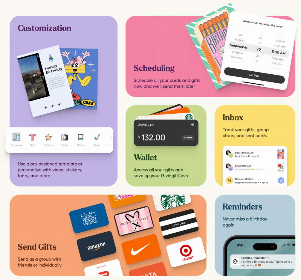
User intuitiveness is a key characteristic of Bento design, making it a popular choice for creating user-friendly interfaces. The compartmentalized format reduces the cognitive load on users by grouping information logically and visually. Instead of being presented with large amounts of information in a linear fashion, users can quickly assess a selection of content blocks, each one containing relevant pieces of information.
The card-based layout, often enhanced with visual cues like icons, contrasting colors, or short descriptions, helps guide users through a page, directing their attention to the areas that matter most. Additionally, Bento design is often very action-oriented, with each card or module containing a clear call-to-action, making it simple for users to interact with the content.
Another aspect of Bento design that enhances intuitiveness is its focus on visual hierarchy. Larger cards may be used to highlight important content, while smaller cards can display less crucial information. This hierarchy helps users quickly determine what is most important and navigate accordingly.
Examples of Sites That Implement Bento Design
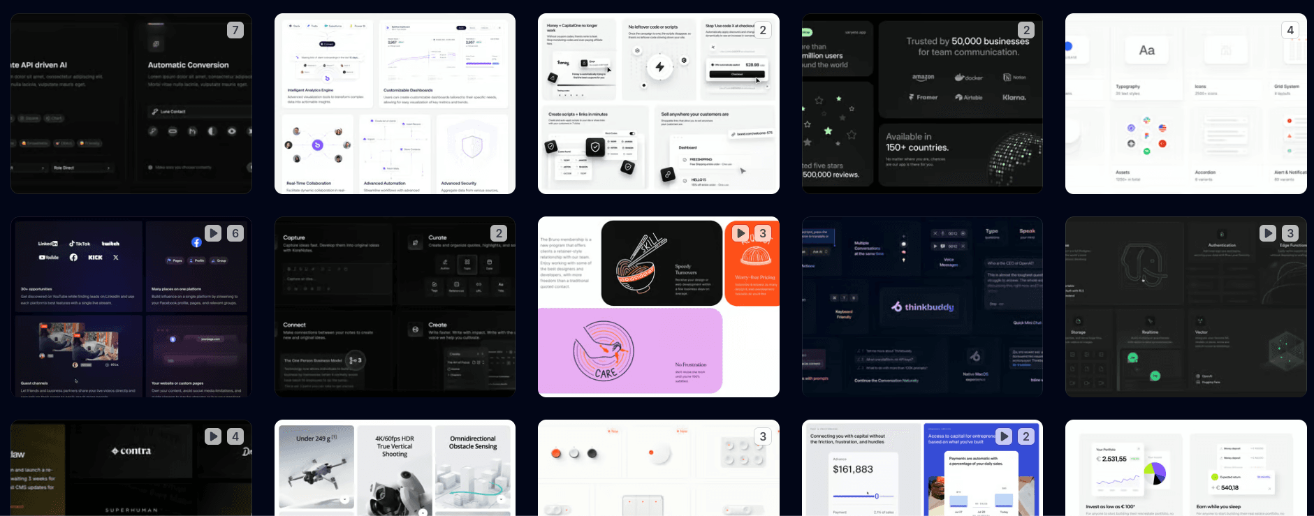
Bento design is used by many of the most-visited product sites on the web. Here are the implementations worth studying in 2026, and what each one teaches.
Apple
Apple did more than anyone to mainstream the pattern, summarising product features as bento grids in keynotes and carrying the same layout onto product pages. The lesson from Apple’s usage is hierarchy discipline: one hero cell carries the headline capability, supporting cells carry exactly one fact each, and nothing competes. If you study a single bento implementation, make it this one.
Linear and Vercel
Linear and Vercel represent the SaaS state of the art: dark-first bento grids where tiles contain live product UI, animated demos and real data rather than icons and adjectives. The lesson here is that the tile is a container for proof, not decoration. This is the style most of our SaaS design clients ask for by name, usually by sending one of these two sites.
Supabase
Supabase uses bento grids to present a genuinely complicated product (a full backend platform) as a set of digestible capabilities, mixing code snippets, diagrams and stats across cells. The lesson: bento is at its best when the underlying product is complex, because the grid does the simplifying that paragraphs can’t.
Notion
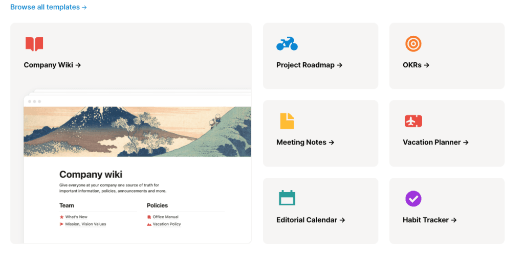
Notion uses Bento design principles throughout its interface and marketing. The platform uses modular blocks to organize tasks, notes, and projects into neat, visual sections that users can easily manipulate. This grid-style format keeps the user interface clean, visually appealing, and extremely easy to navigate.
Pinterest and Medium (With a Caveat)
Pinterest is often cited as bento design, and it’s a useful comparison precisely because it’s technically something else: a masonry layout, where uniform-width tiles flow to arbitrary heights. True bento uses a fixed grid with deliberately sized cells to create hierarchy; masonry treats every cell as equal. Pinterest teaches the browsing power of tiles, but if you want the guided, hierarchical experience, bento’s fixed grid is the tool. Medium sits between the two, using modular sections to highlight featured posts and categories, creating a smooth reading experience that helps content discoverability.
You can browse hundreds more live examples at bentogrids.com, which remains the best-curated gallery of the pattern.
How to Build a Bento Grid (With Code)
Modern CSS makes bento straightforward: one grid container, cells that span rows and columns to create the hierarchy, and a collapse strategy for mobile. Here is a minimal, production-sensible starting point:
.bento {
  display: grid;
  grid-template-columns: repeat(4, 1fr);
  grid-auto-rows: 180px;
  gap: 16px;
}

.bento > * {
  border-radius: 16px;
  padding: 24px;
  background: var(--tile-bg, #f5f5f5);
}

/* Hierarchy through spans */
.tile--hero  { grid-column: span 2; grid-row: span 2; }
.tile--wide  { grid-column: span 2; }
.tile--tall  { grid-row: span 2; }

/* Mobile: collapse to a single column in story order */
@media (max-width: 640px) {
  .bento { grid-template-columns: 1fr; grid-auto-rows: auto; }
  .bento > * { grid-column: auto; grid-row: auto; }
}
Three implementation rules that separate good grids from card soup. First, consistent gaps and corner radii everywhere; the grid’s coherence comes entirely from that consistency. Second, decide the mobile stacking order deliberately, because a grid that reads hero-first on desktop can collapse into nonsense on a phone; reorder in the DOM or with explicit placement so the story survives. Third, one job per tile. The moment a cell contains two messages, it stops being bento and starts being a brochure.
Accessibility in Bento Layouts
Bento grids have one accessibility trap: visual order and DOM order can diverge when cells are repositioned with grid placement, which breaks keyboard navigation and screen reader flow. Keep the DOM in reading order and use spans rather than explicit repositioning where possible. Beyond that, treat each tile as a landmark of content: proper heading levels inside tiles, sufficient contrast on tiles with image backgrounds, and if a whole tile is clickable, one link wrapping the tile rather than multiple competing targets. An accessible grid is also, not coincidentally, the one Google’s crawler understands best.
When Not to Use Bento Design
Honesty section, because a pattern this popular gets misapplied. Bento is the wrong tool for long-form reading (articles want a single measure of text, not fragments), for step-by-step flows like checkouts and onboarding (sequence matters more than overview), and for pages with one message (a grid of one is just a box). It also fails when the content is thin: bento amplifies whatever you put in it, and eight tiles of filler read as eight times the emptiness. If your feature set genuinely reduces to two points, write two good sections instead. The test we use in our own WordPress design work in London: does this content have five or more unequal things worth showing at once? If yes, bento earns its place. If no, it’s decoration.
Why Bento Design Offers a Better User Experience
Bento design’s popularity is largely due to its ability to offer a better overall user experience compared to more traditional layouts. Here are some of the main reasons why Bento design stands out:
- Organized Content Presentation: Bento design makes content easy to find by visually grouping different information types. Unlike cluttered, text-heavy layouts, users can quickly scan and identify the sections they are most interested in.
- Engagement-Driven Layout: The modular, card-like layout encourages interaction. Users can click on cards for more information, effectively allowing them to “choose their own adventure” without committing to reading everything at once. This approach is especially effective for maintaining user engagement and increasing on-site dwell time.
- Guided User Journey: By utilizing visual hierarchy within the Bento grid, designers can guide users through a journey by highlighting important sections while offering secondary content in smaller or less prominent modules. This prioritization allows users to understand what’s crucial at a glance, creating a smoother experience.
- Adaptability Across Devices: With more users browsing on smartphones, tablets, and various screen sizes, Bento design stands out for its adaptability. The grid structure makes it easy for websites to rearrange content automatically, ensuring that users always receive a seamless browsing experience regardless of device.
- Consistent Design Language: Bento design promotes consistency, as each content card follows a uniform style. This consistency allows users to understand how to interact with different parts of the site intuitively. Once a user learns how one card works, they can easily interact with others, making the entire experience feel predictable and comfortable.
- Visual Appeal: Users are drawn to visually pleasing interfaces, and Bento design delivers precisely that. By focusing on distinct tiles, bold images, and generous whitespace, Bento layouts are visually engaging, and they provide a sense of balance that users appreciate.
- Easier Decision-Making: Presenting information in modular blocks also helps users make decisions faster. Instead of having to scroll through long paragraphs to determine which part of the content is relevant, users can pick a card and dive in for more information if needed. This segmentation supports a faster, goal-oriented approach to browsing.
- Scalability for Future Content: Bento design is an ideal choice for dynamic websites with ever-changing content. As businesses grow or need to present new features, Bento layouts can easily scale by adding or removing cards without disrupting the website’s overall look and feel.
Conclusion
Bento design has proven to be a powerful approach for creating clean, organised, and visually appealing websites that users find intuitive and easy to navigate. By segmenting information into individual, well-designed content blocks, Bento design reduces cognitive load, improves visual clarity, and provides a more engaging user experience. Its survival past the trend cycle, and its adoption by Apple, Linear, Vercel, Supabase and Notion, confirms it as a modern layout convention rather than a passing fashion.
The craft is in the restraint: one strong grid where the content earns it, deliberate hierarchy through tile size, an intentional mobile collapse, and accessibility kept intact. Used that way, bento remains one of the most effective patterns available for presenting complex offerings simply.
If you’re considering a bento-led redesign, or you want a grid that carries real product proof the way the best 2026 implementations do, that’s a conversation our web design team has weekly. We’ll tell you honestly whether your content suits the pattern, and show you what it looks like when it does.